library(tidyverse)
library(patchwork)
library(extraDistr)

theme_set(theme_minimal())Distributions
Numbers have shapes. Distributions describe those shapes. Parameters describe those distribtuions.
Uniform distribution
- The uniform distribution represents values between a minimum or maximum, where each value is equally probable
- There is no gravity or spread
In a uniform distribution, every number is equally likely. This like rolling a single die or picking a random number between 1 and 10 (though not in real life!)
set.seed(1234)
die <- tibble(value = sample(1:6, size = 10000, replace = TRUE))

die |>
  count(value)
## # A tibble: 6 × 2
##   value     n
##   <int> <int>
## 1     1  1637
## 2     2  1673
## 3     3  1700
## 4     4  1659
## 5     5  1679
## 6     6  1652

die |>
  count(value) |>
  ggplot(aes(x = value, y = n)) +
  geom_col() +
  labs(title = "10,000 rolls of a single die")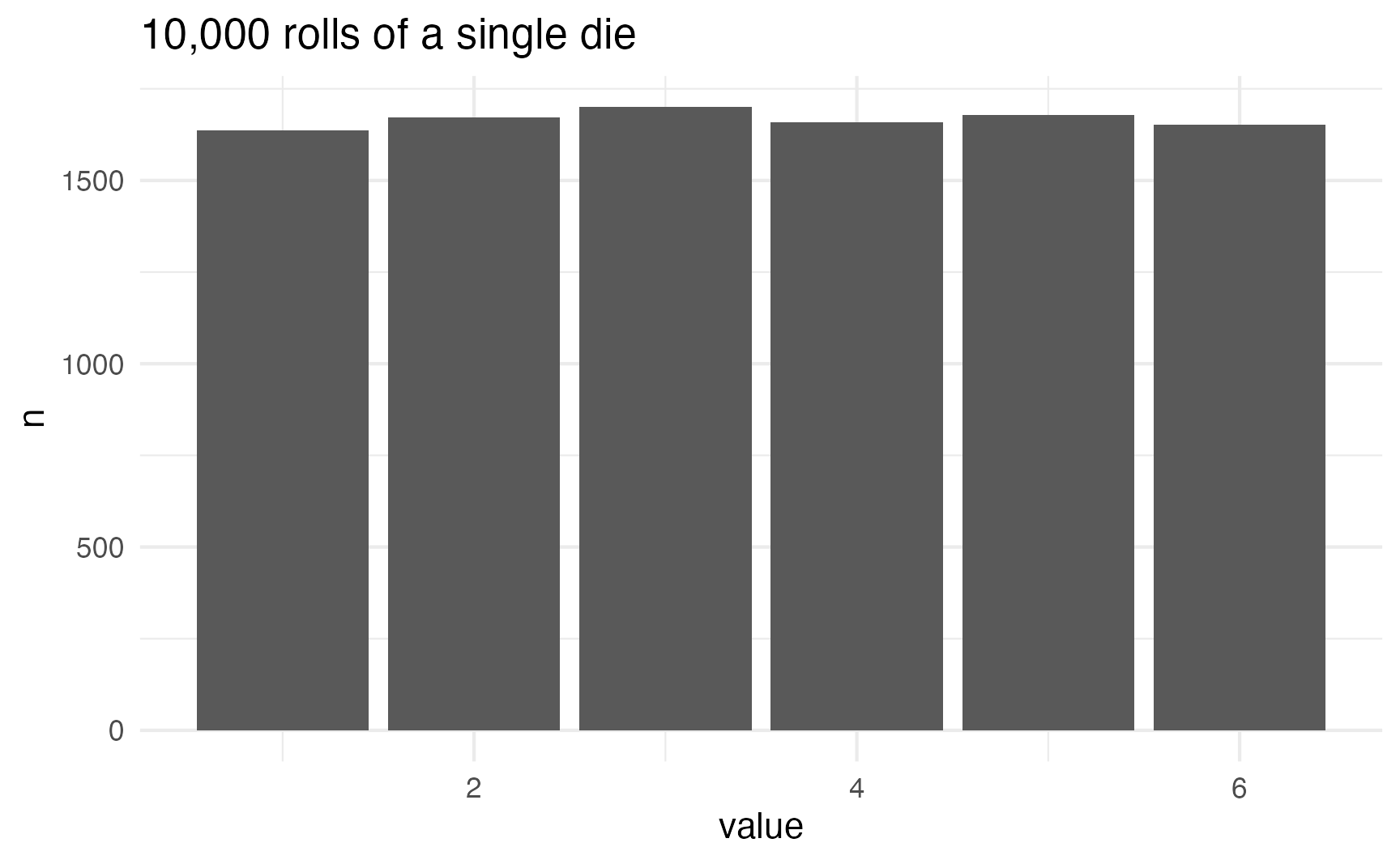
This distribution takes two parameters: a minimum and a maximum. It can generate continuous values with runif() and discrete values with sample()
sample()
The sample() function chooses an element from a list. The size argument defines how many numbers to choose.
# Choose 1 random number
sample(1:6, size = 1)
## [1] 1

# Choose 3 random numbers
sample(1:6, size = 3)
## [1] 6 5 2
One important function argument is replace, which essentially puts the number back into the pool of possible numbers. Imagine having a bowl full of ping pong balls with the numbers 1–6 on them. If you take the number “3” out, you can’t draw it again. If you put it back in, you can pull it out again. The replace argument puts the number back after it’s drawn:
# Choose 10 random numbers, with replacement
sample(1:6, size = 10, replace = TRUE)
##  [1] 6 5 3 1 1 3 5 6 2 6
If you don’t specify replace = TRUE, and you try to choose more numbers than are in the set, you’ll get an error:
# Choose 8 numbers between 1 and 6, but don't replace them.
# This won't work!
sample(1:6, size = 8)
## Error in sample.int(length(x), size, replace, prob): cannot take a sample larger than the population when 'replace = FALSE'
runif()
runif() will choose continuous numbers between a minimum and a maximum. Here are 5 numbers between 35 and 56:
runif(5, min = 35, max = 56)
## [1] 48.12390 51.15575 43.29038 42.98839 53.48598
You can confirm that each number has equal probability with a histogram. Here are 5,000 random people between 18 and 35:
set.seed(1234)
lots_of_numbers <- tibble(age = runif(5000, min = 18, max = 35))

# These are all continuous
lots_of_numbers
## # A tibble: 5,000 × 1
##      age
##    <dbl>
##  1  19.9
##  2  28.6
##  3  28.4
##  4  28.6
##  5  32.6
##  6  28.9
##  7  18.2
##  8  22.0
##  9  29.3
## 10  26.7
## # ℹ 4,990 more rows

# But we can stick them in one-year buckets
ggplot(lots_of_numbers, aes(x = age)) +
  geom_histogram(binwidth = 1, color = "white", boundary = 18)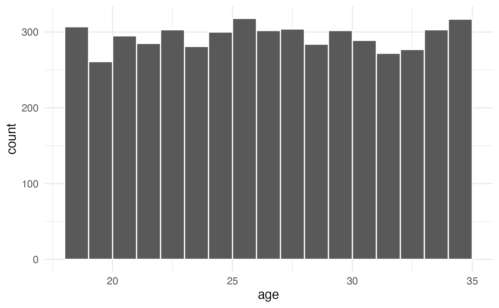
If you don’t want to generate random numbers, you can use dunif() instead of runif() to plot the exact mathematical density of the distribution:
# Continuous density
ggplot() +
  stat_function(fun = \(x) dunif(x, 18, 35), geom = "area") +
  xlim(c(18, 35)) +
  labs(title = "Uniform(18, 35)")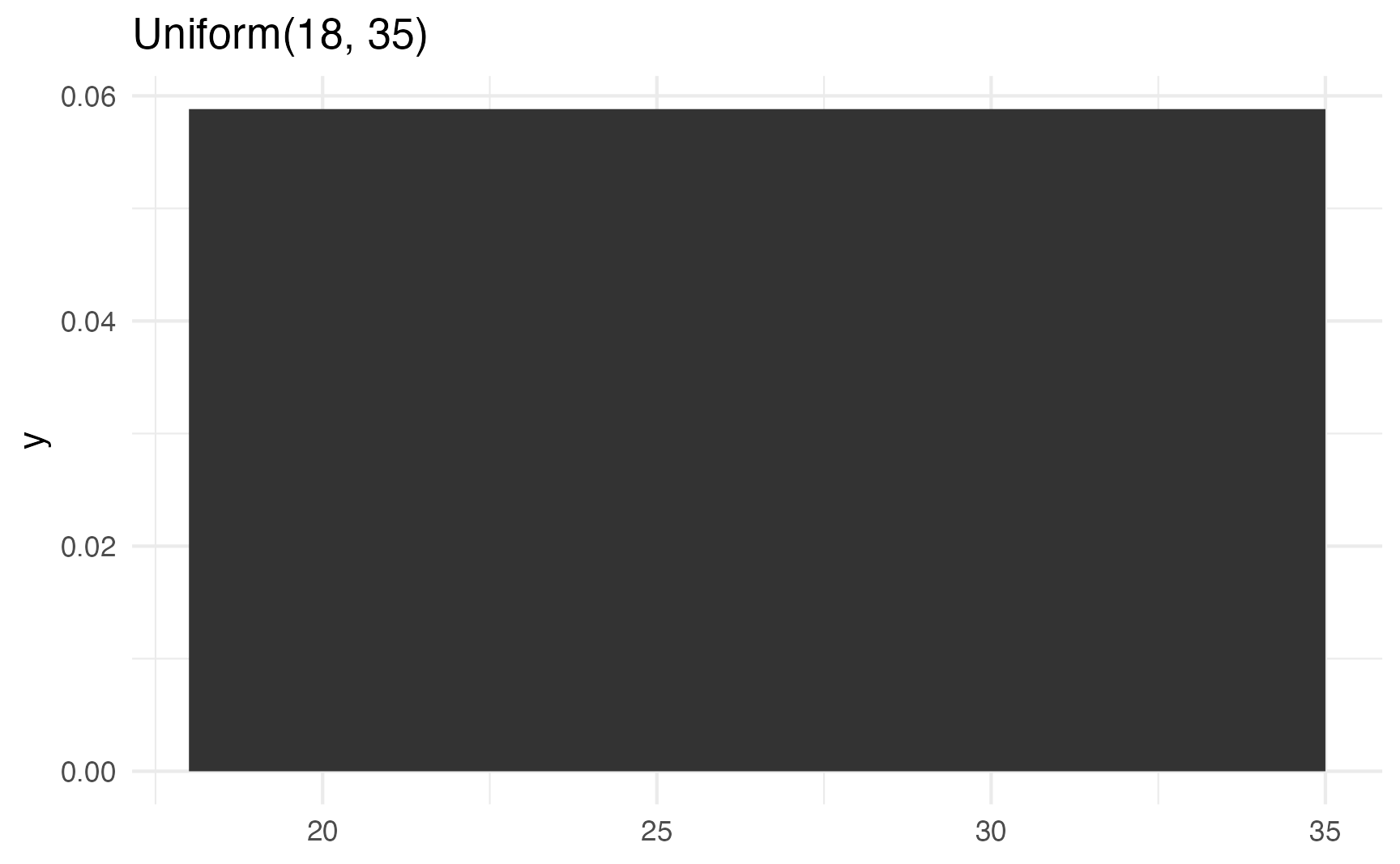
# Discrete density
tibble(x = 18:35) |>
  mutate(density = dunif(x, 18, 35)) |>
  ggplot(aes(x = x, y = density)) +
  geom_col() +
  labs(title = "Uniform(18, 35)")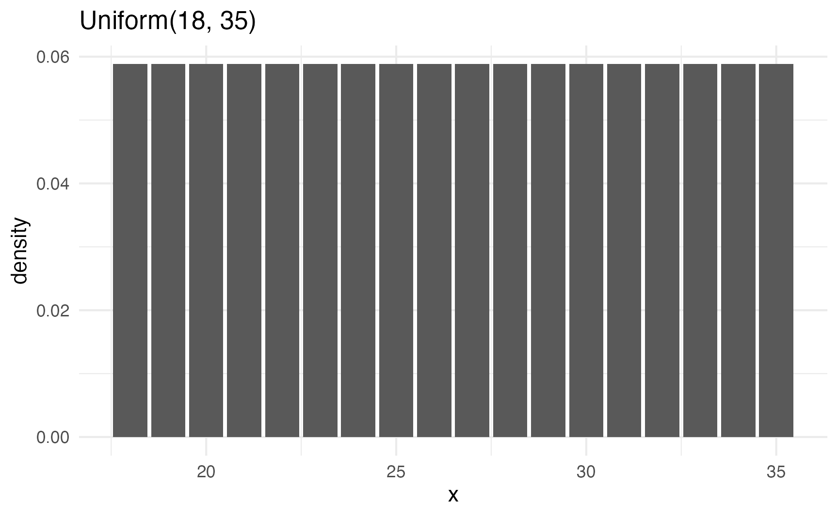
Normal distribution
- The normal distribution represents a number with a central tendency or mean, and variation around that mean.
- The distribution uses two parameters:
- \(\mu\) (mu) for the mean
- \(\sigma\) (sigma) for the standard deviation or spread or variation around the mean
Most numbers that exist in the world tend to have higher probabilities around certain values—almost like gravity around a specific point. For instance, income is not uniformly distributed—a handful of people are really really rich, lots are very poor, and most are kind of clustered around an average.
The idea of having possible values clustered around an average is how the rest of these distributions work (uniform distributions don’t have any sort of central gravity point; all these others do). Each distribution is defined by different things called parameters, or values that determine the shape of the probabilities and locations of the clusters.
A super common type of distribution is the normal distribution. This is the famous “bell curve” you learn about in earlier statistics classes. A normal distribution has two parameters:
- A mean (the center of the cluster)
- A standard deviation (how much spread there is around the mean).
In R, you can generate random numbers from a normal distribution with the rnorm() function. It takes three arguments: the number of numbers you want to generate, the mean, and the standard deviation. It defaults to a mean of 0 and a standard deviation of 1, which means most numbers will cluster around 0, with a lot between −1 and 1, and some going up to −2 and 2 (technically 67% of numbers will be between −1 and 1, while 95% of numbers will be between −2–2ish)
rnorm(5)
## [1] -1.3662376  0.5392093 -1.3219320 -0.2812887 -2.1049469

# Cluster around 10, with an SD of 4
rnorm(5, mean = 10, sd = 4)
## [1] 3.529581 7.105072 11.226964 10.902385 13.742864set.seed(1234)
plot_data <- tibble(x = rnorm(1000, mean = 10, sd = 4))
head(plot_data)
## # A tibble: 6 × 1
## x
## <dbl>
## 1 5.17
## 2 11.1
## 3 14.3
## 4 0.617
## 5 11.7
## 6 12.0
ggplot(plot_data, aes(x = x)) +
geom_histogram(binwidth = 1, boundary = 0, color = "white")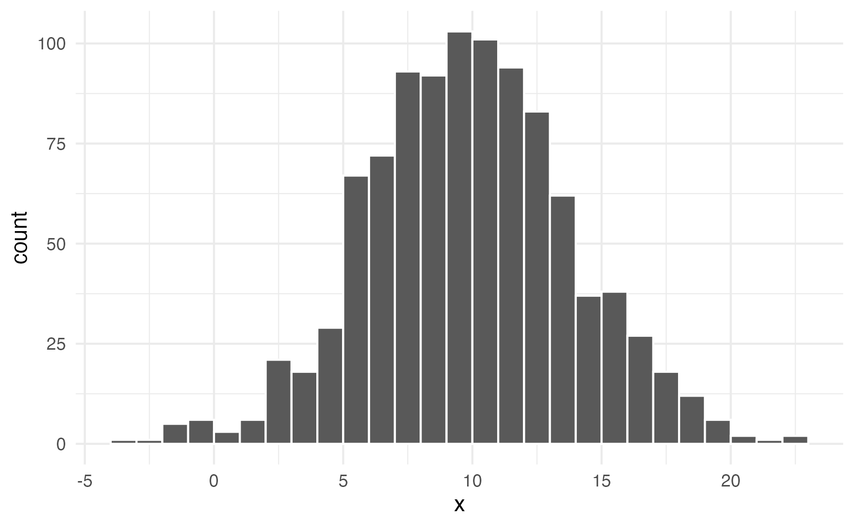
Neat. Most numbers are around 10; lots are between 5 and 15; some go as high as 25 and as low as −5.
You can also plot the density using math instead of random numbers by using dunif():
ggplot() +
  stat_function(fun = \(x) dnorm(x, 10, 4), geom = "area") +
  xlim(c(-5, 25)) +
  labs(title = "Normal(10, 4)")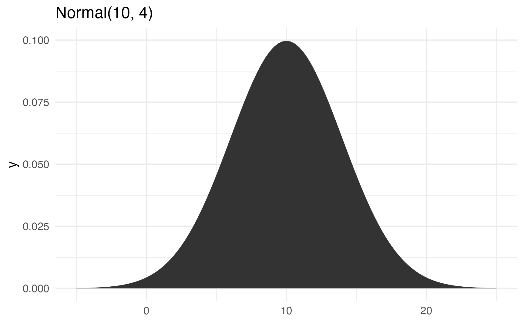
Watch what happens if you change the standard deviation to 10 to make the spread wider:
ggplot() +
  stat_function(fun = \(x) dnorm(x, 10, 10), geom = "area") +
  xlim(c(-25, 45)) +
  labs(title = "Normal(10, 10)")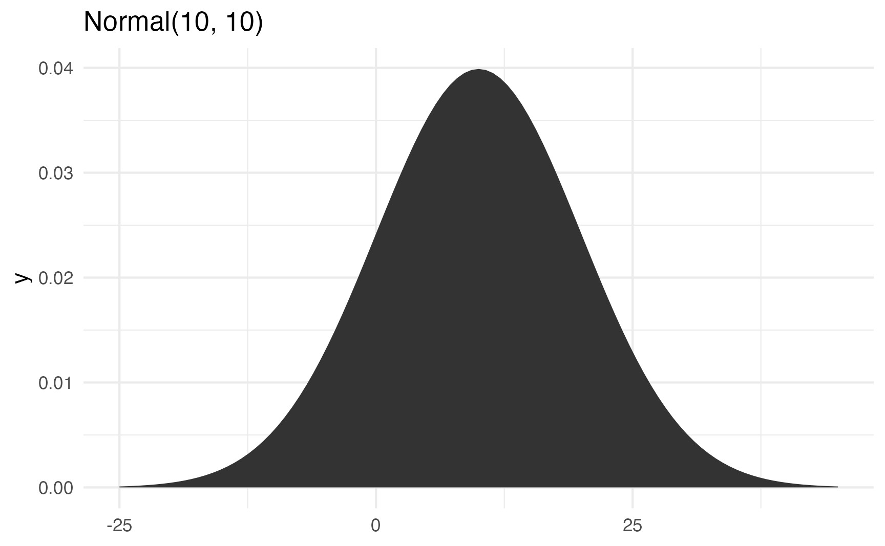
It’s still centered around 10, but now you get values as high as 40 and as low as −20. The data is more spread out now.
In the real world, incomes, ages, education, etc. all have a kind of gravity to them, and a normal distribution is a good way of showing that gravity. For instance, here are 1,000 simulated people with reasonable random incomes, ages, and years of education:
set.seed(1234)

fake_people <- tibble(
  income = rnorm(1000, mean = 40000, sd = 15000),
  age = rnorm(1000, mean = 25, sd = 8),
  education = rnorm(1000, mean = 16, sd = 4)
)
head(fake_people)
## # A tibble: 6 × 3
##   income   age education
##    <dbl> <dbl>     <dbl>
## 1 21894. 15.4      12.1
## 2 44161. 27.4      15.6
## 3 56267. 12.7      15.6
## 4  4815. 30.1      20.8
## 5 46437. 30.6       9.38
## 6 47591.  9.75     11.8

fake_income <- ggplot(fake_people, aes(x = income)) +
  geom_histogram(binwidth = 5000, color = "white", boundary = 0) +
  labs(title = "Simulated income")

fake_age <- ggplot(fake_people, aes(x = age)) +
  geom_histogram(binwidth = 2, color = "white", boundary = 0) +
  labs(title = "Simulated age")

fake_education <- ggplot(fake_people, aes(x = education)) +
  geom_histogram(binwidth = 2, color = "white", boundary = 0) +
  labs(title = "Simulated education")

fake_income + fake_age + fake_education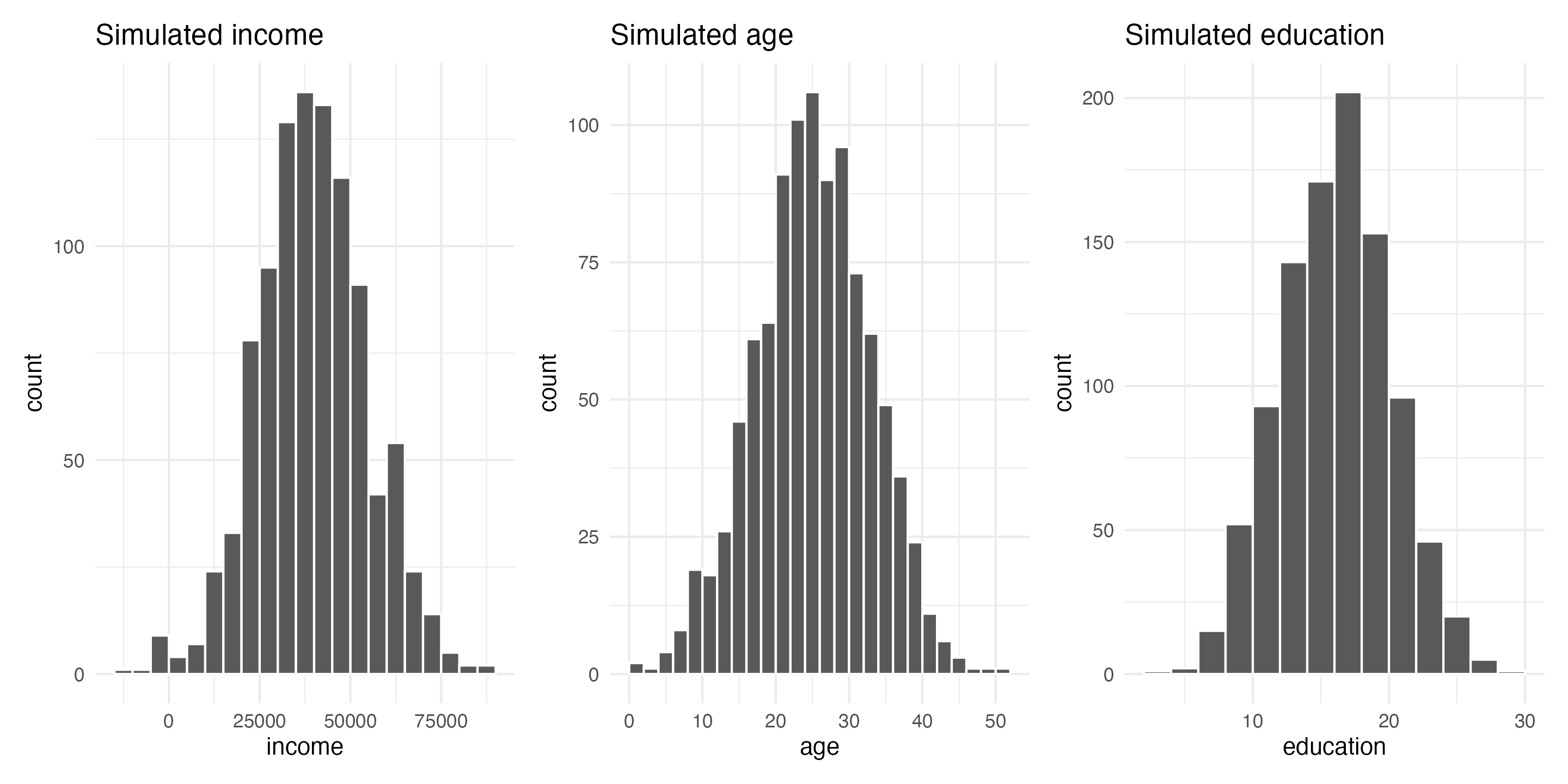
These three columns all have different centers and spreads. Income is centered around $45,000, going up to almost $100,000 and as low as −$10,000; age is centered around 25, going as low as 0 and as high as 50; education is centered around 16, going as low as 3 and as high as 28. Cool.
Poisson distribution
- The Poisson distribution represents counts that are produced based on a rate; variable values must be integers.
- The distribution uses only one parameter \(\lambda\) (lambda), which controls the rate and represents both the mean and the variance/standard deviation.
- The negative binomial distribution also represents counts based on a rate, but it allows the variance to be different from the mean and takes two parameters: \(\mu\) (mu) for the mean and \(r\) for the dispersion.
A Poisson distribution (named after French mathematician Siméon Denis Poisson) represents counts of independent events based on a rate.
For instance, let’s say you’re sitting at the front door of a coffee shop (in pre-COVID days) and you count how many people are in each arriving group. You’ll see something like this:
- 1 person
- 1 person
- 2 people
- 1 person
- 3 people
- 2 people
- 1 person
Lots of groups of one, some groups of two, fewer groups of three, and so on. That’s a Poisson process: a bunch of independent random events that combine into grouped events.
Lots of real life things follow this pattern: household size, the number of cars in traffic, the number of phone calls received by an office, arrival times in a line, the number of goals scored in World Cup soccer games, and even the outbreak of wars.
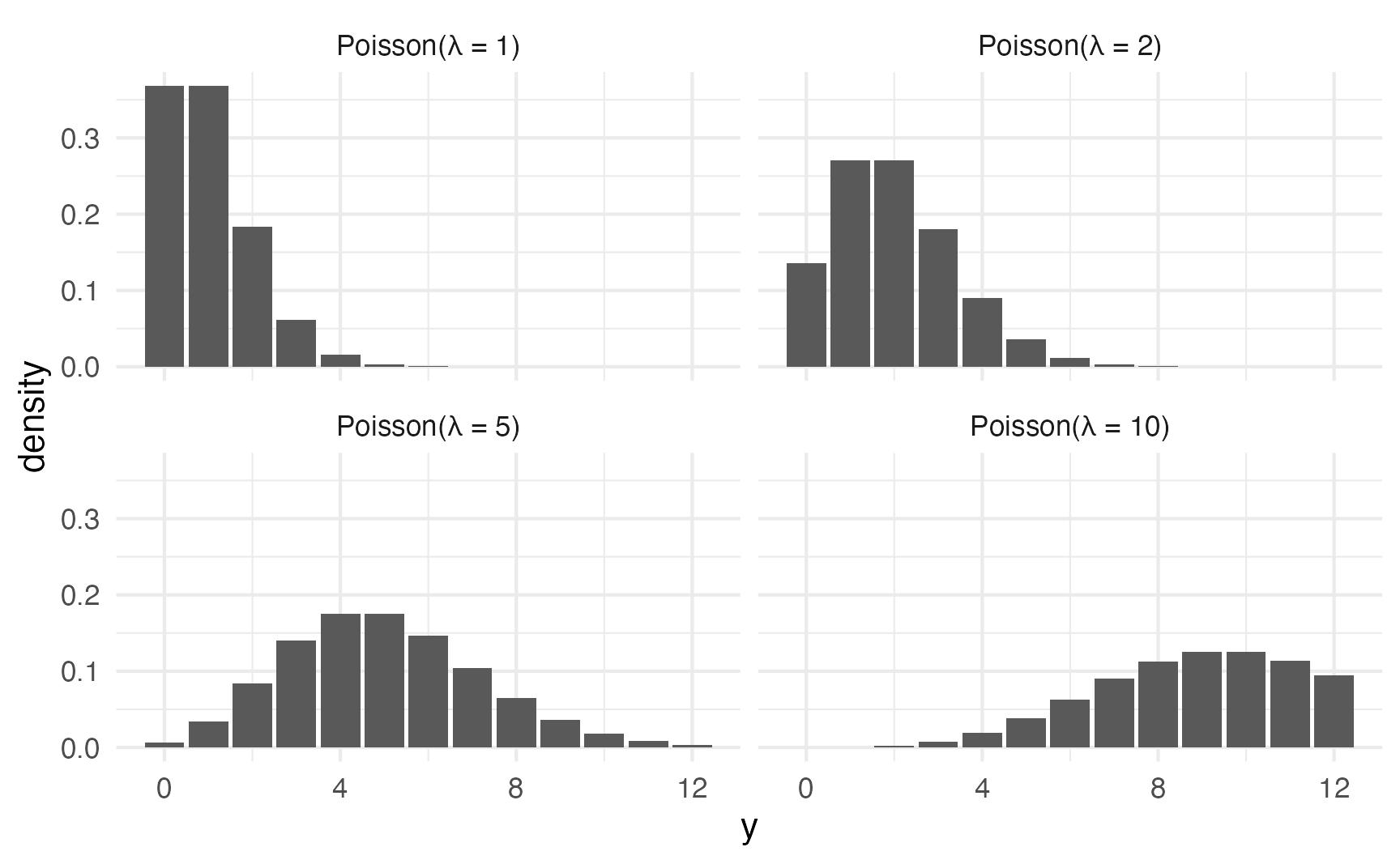
In general, as the rate of events \(\lambda\) increases…
- the typical number of events increases,
- the variability increases, and
- the skew decreases
expand_grid(y = 0:12, lambda = c(1, 2, 5, 10)) |>
  mutate(density = dpois(y, lambda)) |>
  ggplot(aes(x = y, y = density)) +
  geom_col() +
  facet_wrap(
    vars(lambda),
    labeller = as_labeller(\(x) glue::glue("Poisson(λ = {x})"))
  )
Negative binomial distribution
Poisson distributions only take one parameter because the mean and variance should be identical in a true Poisson process.
For instance, here are 10,000 random Poisson numbers with a \(\lambda\) of 2:
set.seed(1234)
poisson_numbers <- tibble(x = rpois(10000, lambda = 2))
The mean and variance are both 2:
poisson_numbers |>
  summarize(avg = mean(x), var = var(x))
## # A tibble: 1 × 2
##     avg   var
##   <dbl> <dbl>
## 1  2.00  1.94
But what if your real life data doesn’t have the same mean and variance? For instance, this distribution looks Poisson-y:
set.seed(1234)
not_poisson_numbers <- tibble(x = rnbinom(10000, mu = 2, size = 0.8))
not_poisson_numbers |>
count(x) |>
ggplot(aes(x = x, y = n)) +
geom_col()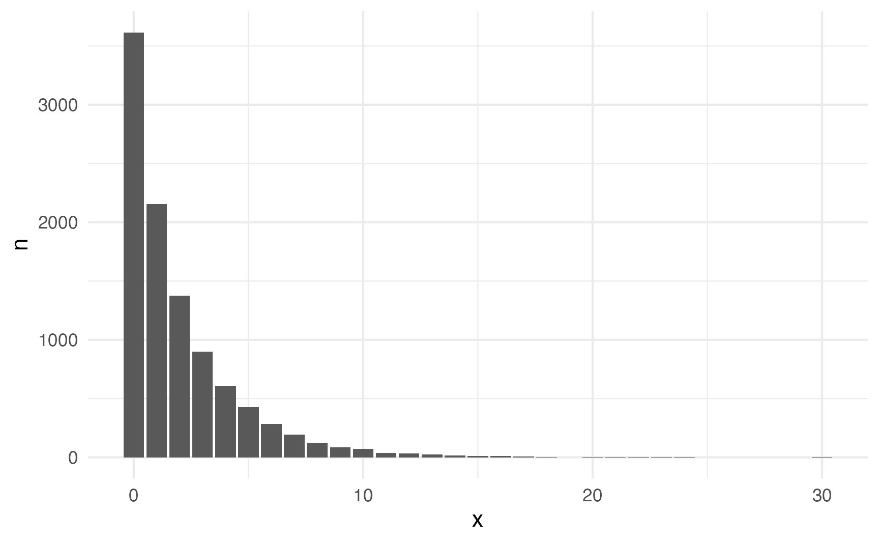
But the mean and variance aren’t the same:
not_poisson_numbers |>
  summarize(avg = mean(x), var = var(x))
## # A tibble: 1 × 2
##     avg   var
##   <dbl> <dbl>
## 1  1.99  6.91
Fortunately we can use the negative binomial distribution, which takes separate parameters for the mean and variance instead of combining the two into a single \(\lambda\) parameter:
- \(\mu\) (mu) for the mean
- \(r\) for the dispersion
Beta distribution
- The Beta distribution represents a proportion between 0 and 1, but does not include 0 or 1.
- The distribution can be parameterized two different ways:
- Shapes: Shape 1 (\(a\)) and Shape 2 (\(b\)), which form a proportion: \(\frac{a}{a + b}\)
- Mean and precision: \(\mu\) (mu) for the average, \(\phi\) (phi) for the variance/standard deviation/spread
The Beta distribution is naturally limited to numbers between 0 and 1 (but importantly doesn’t include 0 or 1). The Beta distribution is an extremely flexible distribution and can take all sorts of different shapes and forms (stare at this amazing animated GIF for a while to see all the different shapes!)
Unlike the Poisson distribution, which just takes one parameter, or the normal distribution, where you use the mean and standard deviation as the distributional parameters, Beta distributions take two non-intuitive parameters: (1) shape1 and (2) shape2, often abbreviated as \(a\) and \(b\). This answer at Cross Validated does an excellent job of explaining the intuition behind beta distributions and it’d be worth it to read it.
Basically Beta distributions are good at modeling the probabilities of things, and shape1 and shape2 represent specific parts of a formula for probabilities and proportions.
Let’s say that there’s an exam with 10 points where most people score a 6/10. Another way to think about this is that an exam is a collection of correct answers and incorrect answers, and that the percent correct follows this equation:
\[ \frac{\text{Number correct}}{\text{Number correct} + \text{Number incorrect}} \]
If you scored a 6, you could write that as:
\[ \frac{6}{6+4} = \frac{6}{10} \]
To make this formula more general, we can use variable names: \(a\) for the number correct and \(b\) for the number incorrect, leaving us with this:
\[ \frac{a}{a + b} \]
In a Beta distribution, the \(a\) and the \(b\) in that equation correspond to the shape1 and shape2 parameters. If we want to look at the distribution of scores for this test where most people get 6/10, or 60%, we can use 6 and 4 as parameters. Most people score around 60%, and the distribution isn’t centered—it’s asymmetric. Neat!
ggplot() +
  stat_function(
    fun = \(x) dbeta(x, 6, 4), geom = "line",
    aes(color = "Beta(shape1 = 6, shape2 = 4)"),
    linewidth = 1
  ) +
  scale_color_viridis_d(option = "plasma", name = NULL) +
  theme(legend.position = "bottom")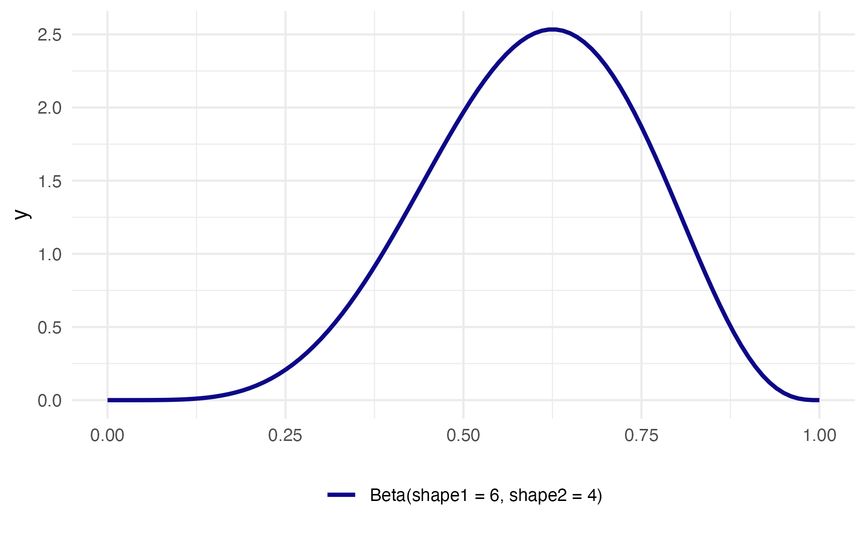
The magic of—and most confusing part about—Beta distributions is that you can get all sorts of curves by just changing the shape parameters. To make this easier to see, we can make a bunch of different Beta distributions.
ggplot() +
  stat_function(
    fun = \(x) dbeta(x, 6, 4), geom = "line",
    aes(color = "Beta(shape1 = 6, shape2 = 4)"),
    linewidth = 1
  ) +
    stat_function(
    fun = \(x) dbeta(x, 60, 40), geom = "line",
    aes(color = "Beta(shape1 = 60, shape2 = 40)"),
    linewidth = 1
  ) +
  stat_function(
    fun = \(x) dbeta(x, 9, 1), geom = "line",
    aes(color = "Beta(shape1 = 9, shape2 = 1)"),
    linewidth = 1
  ) +
  stat_function(
    fun = \(x) dbeta(x, 2, 11), geom = "line",
    aes(color = "Beta(shape1 = 2, shape2 = 11)"),
    linewidth = 1
  ) +
  scale_color_viridis_d(
    option = "plasma", end = 0.8, name = NULL,
    guide = guide_legend(nrow = 2)
  ) +
  theme(legend.position = "bottom")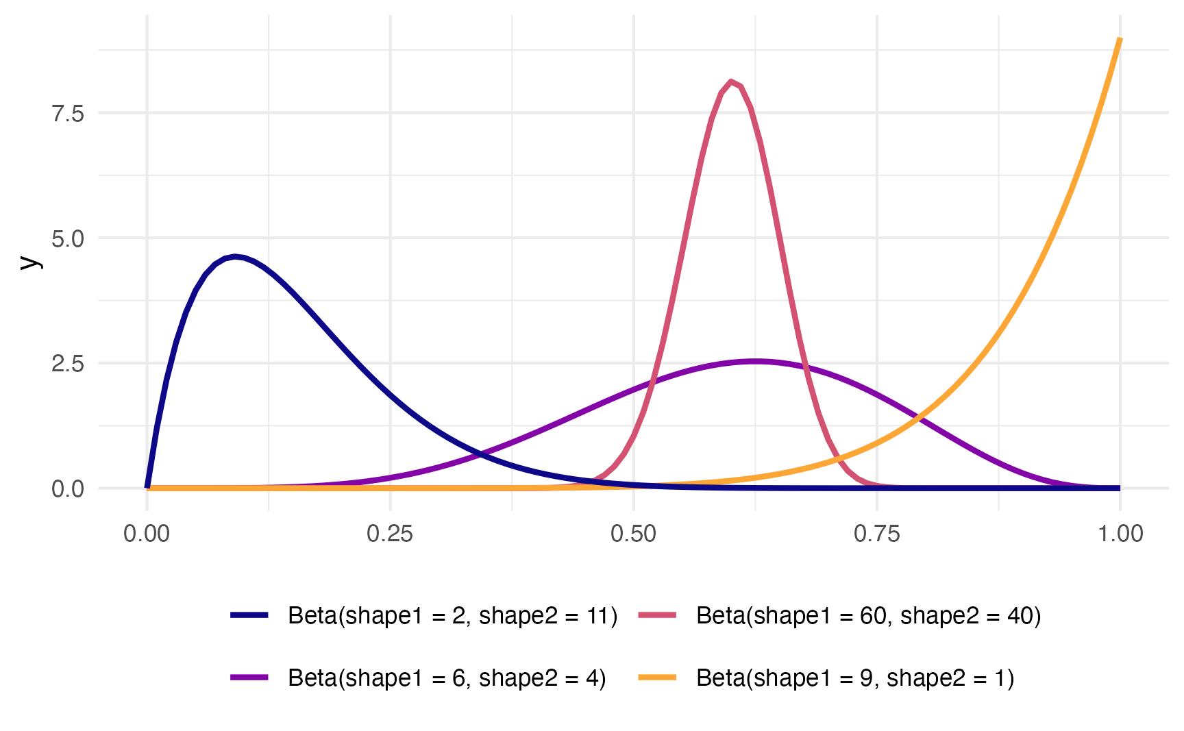
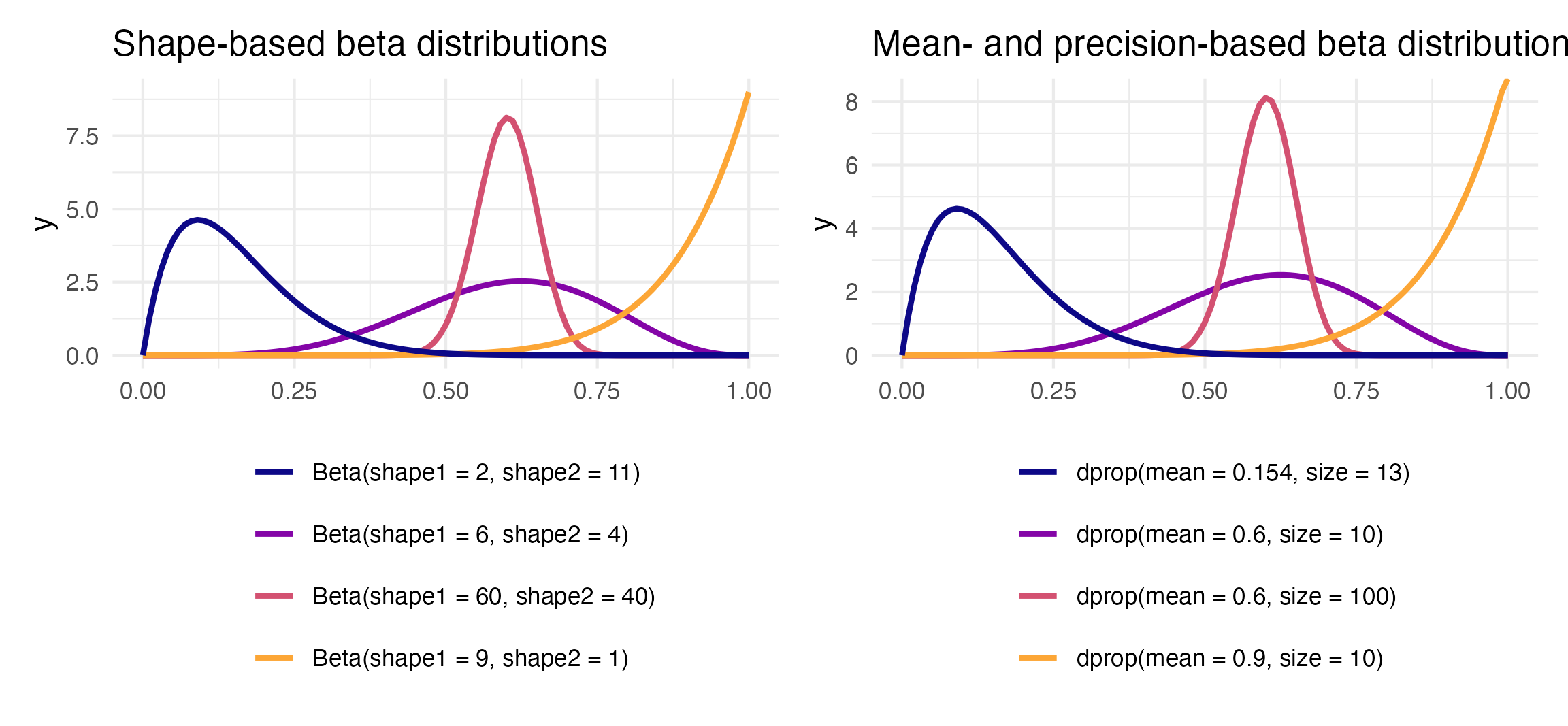
To figure out the center of each of these distributions, think of the \(\frac{a}{a+b}\) formula. For the blue distribution on the far left, for instance, it’s \(\frac{2}{2+11}\) or 0.1538462. The orange distribution on the far right is centered at \(\frac{9}{9+1}\), or 0.9. The tall pink-ish distribution is centered at 0.6 (\(\frac{60}{60+40}\)), just like the \(\frac{6}{6+4}\) distribution, but it’s much narrower and less spread out. When working with these two shape parameters, you control the variance or spread of the distribution by scaling the values up or down.
Mean and precision instead of shapes
But thinking about these shapes and manually doing the \(\frac{a}{a+b}\) calculation in your head is hard! It’s even harder to get a specific amount of spread. Most other distributions can be defined with a center and some amount of spread or variance, but with Beta distributions you’re stuck with these weirdly interacting shape parameters.
Fortunately there’s an alternative way of parameterizing the beta distribution that uses a mean \(\mu\) and precision \(\phi\) (the same idea as variance) instead of these strange shapes.
These shapes and the \(\mu\) and \(\phi\) parameters are mathematically related and interchangeable. Formally, the two shapes can be defined using \(\mu\) and \(\phi\) like so:
\[ \begin{aligned} \text{shape1 } (a) &= \mu \times \phi \\ \text{shape2 } (b) &= (1 - \mu) \times \phi \end{aligned} \]
It’s thus possible to translate between these two parameterizations:
\[ \begin{equation} \begin{aligned}[t] \text{Shape 1:} && a &= \mu \phi \\ \text{Shape 2:} && b &= (1 - \mu) \phi \end{aligned} \qquad\qquad\qquad \begin{aligned}[t] \text{Mean:} && \mu &= \frac{a}{a + b} \\ \text{Precision:} && \phi &= a + b \end{aligned} \end{equation} \]
To help with the intuition, we can make a couple little functions to switch between them.
Code
shapes_to_muphi <- function(shape1, shape2) {
  mu <- shape1 / (shape1 + shape2)
  phi <- shape1 + shape2
  return(list(mu = mu, phi = phi))
}

muphi_to_shapes <- function(mu, phi) {
  shape1 <- mu * phi
  shape2 <- (1 - mu) * phi
  return(list(shape1 = shape1, shape2 = shape2))
}
Remember our initial distribution where shape1 was 6 and shape2 was 4? Here’s are the parameters for that using \(\mu\) and \(\phi\) instead:
Code
shapes_to_muphi(6, 4)
## $mu
## [1] 0.6
##
## $phi
## [1] 10
It has a mean of 0.6 and a precision of 10. That more precise and taller distribution where shape1 was 60 and shape2 was 40?
Code
shapes_to_muphi(60, 40)
## $mu
## [1] 0.6
##
## $phi
## [1] 100
It has the same mean of 0.6, but a much higher precision (100 now instead of 10).
R has built-in support for the shape-based beta distribution with things like dbeta(), rbeta(), etc. We can work with this reparameterized \(\mu\)- and \(\phi\)-based beta distribution using the dprop() (and rprop(), etc.) from the {extraDistr} package. It takes two arguments: size for \(\phi\) and mean for \(\mu\).
beta_shapes <- ggplot() +
  stat_function(
    fun = \(x) dbeta(x, 6, 4), geom = "line",
    aes(color = "Beta(shape1 = 6, shape2 = 4)"),
    linewidth = 1
  ) +
    stat_function(
    fun = \(x) dbeta(x, 60, 40), geom = "line",
    aes(color = "Beta(shape1 = 60, shape2 = 40)"),
    linewidth = 1
  ) +
  stat_function(
    fun = \(x) dbeta(x, 9, 1), geom = "line",
    aes(color = "Beta(shape1 = 9, shape2 = 1)"),
    linewidth = 1
  ) +
  stat_function(
    fun = \(x) dbeta(x, 2, 11), geom = "line",
    aes(color = "Beta(shape1 = 2, shape2 = 11)"),
    linewidth = 1
  ) +
  scale_color_viridis_d(option = "plasma", end = 0.8, name = "",
                        guide = guide_legend(ncol = 1)) +
  labs(title = "Shape-based beta distributions") +
  theme(legend.position = "bottom")

beta_mu_phi <- ggplot() +
  stat_function(
    fun = \(x) dprop(x, mean = 0.6, size = 10), geom = "line",
    aes(color = "dprop(mean = 0.6, size = 10)"),
    linewidth = 1
  ) +
    stat_function(
    fun = \(x) dprop(x, mean = 0.6, size = 100), geom = "line",
    aes(color = "dprop(mean = 0.6, size = 100)"),
    linewidth = 1
  ) +
  stat_function(
    fun = \(x) dprop(x, mean = 0.9, size = 10), geom = "line",
    aes(color = "dprop(mean = 0.9, size = 10)"),
    linewidth = 1
  ) +
  stat_function(
    fun = \(x) dprop(x, mean = 0.154, size = 13), geom = "line",
    aes(color = "dprop(mean = 0.154, size = 13)"),
    linewidth = 1
  ) +
  scale_color_viridis_d(option = "plasma", end = 0.8, name = "",
                        guide = guide_legend(ncol = 1)) +
  labs(title = "Mean- and precision-based beta distributions") +
  theme(legend.position = "bottom")

beta_shapes | beta_mu_phi