Poisson regression

Key points
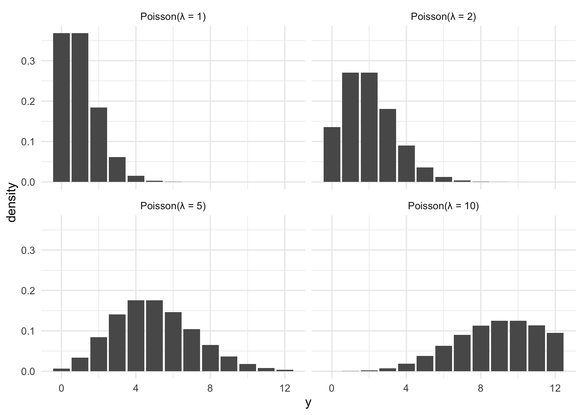
  • The Poisson distribution represents counts that are produced based on a rate; variable values must be integers.
  • The distribution uses only one parameter \(\lambda\) (lambda), which controls the rate and represents both the mean and the variance/standard deviation.
  • The negative binomial distribution also represents counts based on a rate, but it allows the variance to be different from the mean and takes two parameters: \(\mu\) (mu) for the mean and \(r\) for the dispersion.

Code
knitr::opts_chunk$set(fig.align = "center", fig.retina = 3)

library(tidyverse)
library(marginaleffects)
library(brms)
library(tidybayes)
library(parameters)
library(tinytable)

equality <- readRDS("data/equality.rds")

clr_dem <- "#1696d2"
clr_gop <- "#db2b27"
clr_ind <- "#fdbf11"

theme_set(theme_minimal())

options(
  digits = 3, width = 120,
  tinytable_tt_digits = 2
)

Distribution intuition

A Poisson distribution (in French, “poisson” = fish, but here it’s not actually named after the animal, but after French mathematician Siméon Denis Poisson) represents counts of independent events based on a rate.

For instance, let’s say you’re sitting at the front door of a coffee shop (in pre-COVID days) and you count how many people are in each arriving group. You’ll see something like this:

  • 1 person
  • 1 person
  • 2 people
  • 1 person
  • 3 people
  • 2 people
  • 1 person

Lots of groups of one, some groups of two, fewer groups of three, and so on. That’s a Poisson process: a bunch of independent random events that combine into grouped events.

Lots of real life things follow this pattern: household size, the number of cars in traffic, the number of phone calls received by an office, arrival times in a line, and even the outbreak of wars.

In general, as the rate of events \(\lambda\) increases…

  • the typical number of events increases,
  • the variability increases, and
  • the skew decreases
Code
expand_grid(y = 0:12, lambda = c(1, 2, 5, 10)) |> 
  mutate(density = dpois(y, lambda)) |> 
  ggplot(aes(x = y, y = density)) +
  geom_col() + 
  facet_wrap(
    vars(lambda), 
    labeller = as_labeller(\(x) glue::glue("Poisson(λ = {x})"))
  )

Modeling the distribution parameters

We can use regression to model the \(\lambda\) of a Poisson-distributed outcome. In Poisson models, the \(\lambda\) rate must be positive. But if you model \(\lambda\) with a regression model like

\[ \lambda_i = \beta_0 + \beta_1 X_{i1} + \beta_2 X_{i2} + \dots, \]

the predicted values for \(\lambda\) could be negative. So instead we can force \(\lambda\) to be positive by using a log link function, or

\[ \log(\lambda_i) = \beta_0 + \beta_1 X_{i1} + \beta_2 X_{i2} + \dots \]

In general, the model looks like this:

\[ \begin{aligned} Y_i &\sim \operatorname{Poisson}(\lambda_i) \\ \log(\lambda_i) &= \beta_0 + \beta \mathbf{X}_i \end{aligned} \]

Example: Modeling the count of LGBTQ+ anti-discrimination laws

We want to model the number of LGBTQ+ anti-discrimination laws in states based on how urban a state is and its historical partisan voting patterns. Here’s the general relationship. A regular straight OLS line doesn’t fit the data well, but because the outcome is a count, and because the general relationship is curvy, Poisson regression will work.

Code
ggplot(equality, aes(x = percent_urban, y = laws)) +
  geom_point(aes(fill = historical), pch = 21, size = 4, color = "white") +
  geom_smooth(
    aes(color = "Poisson regression"), se = FALSE, method = "glm", 
    method.args = list(family = "poisson")
  ) +
  geom_smooth(aes(color = "OLS regression"), se = FALSE, method = "lm") +
  scale_fill_manual(values = c(clr_dem, clr_gop, clr_ind)) +
  scale_color_manual(values = c("#3D9970", "#FF851B")) +
  labs(
    x = "Percent urban", 
    y = "Count of laws", 
    color = NULL, 
    fill = "Party"
  ) +
  theme(legend.position = "bottom")

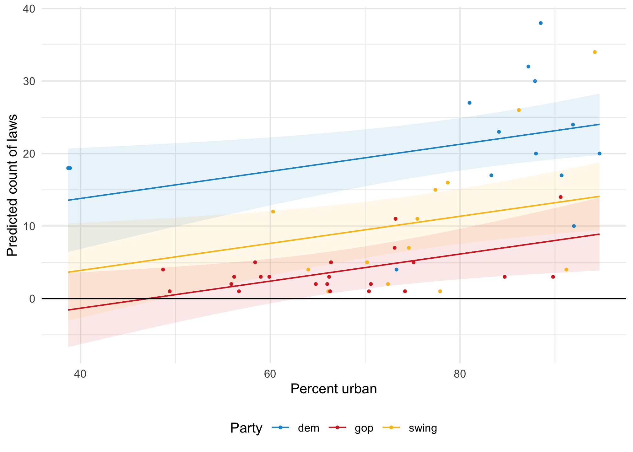
If we model this with regular OLS, we’ll get predictions of negative laws:

Code
model_ols <- lm(laws ~ percent_urban + historical, data = equality)

plot_predictions(model_ols, condition = c("percent_urban", "historical")) +
  geom_hline(yintercept = 0) +
  geom_point(
    data = equality, 
    aes(x = percent_urban, y = laws, color = historical),
    size = 0.75
  ) +
  scale_color_manual(values = c(clr_dem, clr_gop, clr_ind)) +
  scale_fill_manual(values = c(clr_dem, clr_gop, clr_ind), guide = "none") +
  labs(
    x = "Percent urban", 
    y = "Predicted count of laws", 
    color = "Party"
  ) +
  theme(legend.position = "bottom")

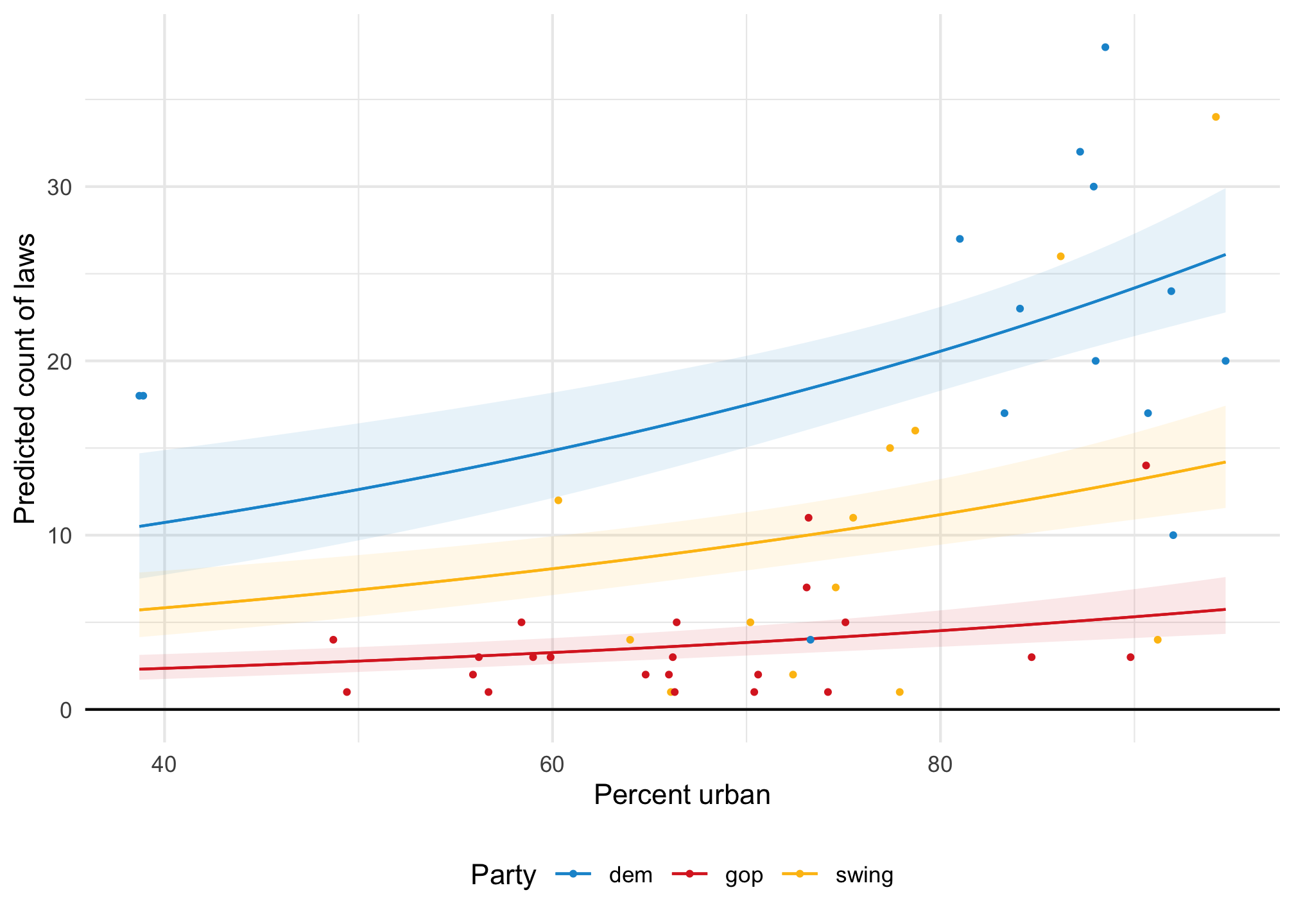
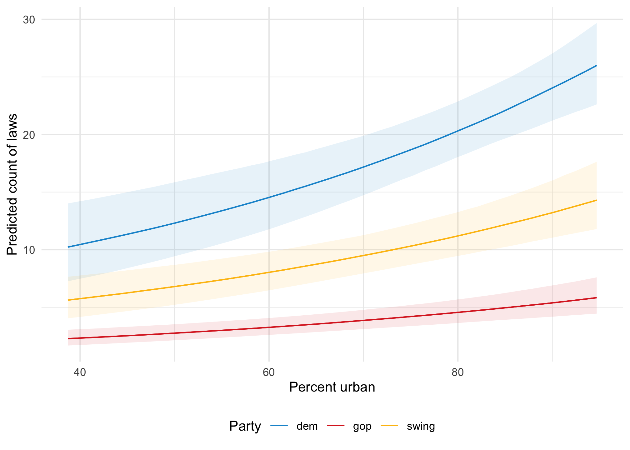
If we model it using Poisson, all the predictions are positive and the predicted lines are curvy and better fit the data:

Code
model_poisson <- glm(
  laws ~ percent_urban + historical, 
  data = equality,
  family = poisson(link = "log")
)

plot_predictions(model_poisson, condition = c("percent_urban", "historical")) +
  geom_hline(yintercept = 0) +
  geom_point(
    data = equality, 
    aes(x = percent_urban, y = laws, color = historical),
    size = 0.75
  ) +
  scale_color_manual(values = c(clr_dem, clr_gop, clr_ind)) +
  scale_fill_manual(values = c(clr_dem, clr_gop, clr_ind), guide = "none") +
  labs(
    x = "Percent urban", 
    y = "Predicted count of laws", 
    color = "Party"
  ) +
  theme(legend.position = "bottom")

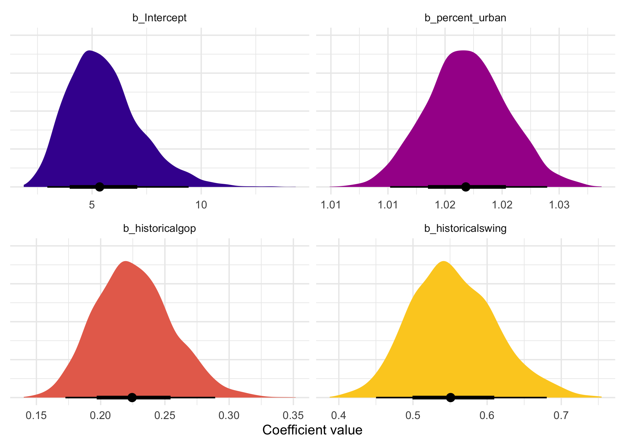
Interpreting coefficients

The coefficients in the model are on a logged scale, which make them a little weird to work with. Here’s a basic frequentist model, with coefficients logged and exponentiated:

Code
model_basic <- glm(laws ~ percent_urban + historical, data = equality,
                   family = poisson(link = "log"))

model_parameters(model_basic) |> 
  tt() |> 
  format_tt(j = "p", fn = scales::label_pvalue())
tinytable_teavorzsr5j2dhkqnr5y
Parameter Coefficient SE CI CI_low CI_high z df_error p
(Intercept) 1.722 0.3049 0.95 1.1051 2.301 5.6 Inf <0.001
percent_urban 0.016 0.0036 0.95 0.0095 0.023 4.6 Inf <0.001
historicalgop -1.514 0.1353 0.95 -1.7842 -1.253 -11.2 Inf <0.001
historicalswing -0.609 0.1054 0.95 -0.8182 -0.405 -5.8 Inf <0.001
Code
model_parameters(model_basic, exponentiate = TRUE) |> 
  tt() |> 
  format_tt(j = "p", fn = scales::label_pvalue())
tinytable_o63sv9xr94jqqz38uzaz
Parameter Coefficient SE CI CI_low CI_high z df_error p
(Intercept) 5.6 1.707 0.95 3.02 9.98 5.6 Inf <0.001
percent_urban 1.02 0.0036 0.95 1.01 1.02 4.6 Inf <0.001
historicalgop 0.22 0.0298 0.95 0.17 0.29 -11.2 Inf <0.001
historicalswing 0.54 0.0573 0.95 0.44 0.67 -5.8 Inf <0.001
  • For the intercept \(\beta_0\), this is the intercept on the logged scale when percent urban is 0 in historically Democratic states (since it’s the omitted base case). We can backtransform this to the response/count scale by exponentiating it: \(e^{1.7225} = 5.599\). That means that in a historically Democratic non-urban state, we’d expect to see 5.6 anti-discrimination laws.

    But the most un-urban Democratic states are Maine and Vermont, each at 38% urban, so the intercept isn’t super important here.

  • For the percent urban \(\beta_1\) coefficient, this is the slope of the line on the log scale. We can expect the logged number of laws in states to increase by 0.0163 for every additional percentage point of urban-ness. To make that more interpretable we can exponentiate it (\(e^{0.0163} = 1.0164\)), which means that a 1 percentage point increase in urban-ness is associated with 1.0164 times more anti-discrimination laws (or 1.64%)

  • For the party/historical \(\beta_2\) and \(\beta_3\) coefficients, these are the shifts in the logged Democratic intercept (again because it’s the omitted base case). We’d thus expect the logged number of laws in GOP states to be 1.5 lower on average. That makes no sense when logged, but if we exponentiate it (\(e^{-1.5145} = 0.2199\)), we find that GOP states should have 22% as many anti-discrimination laws as a Democratic state (or only 22% of what a typical Democratic state would have).

Even when exponentiated, these coefficients are a litte weird because they’re not on the scale of the outcome. They don’t represent changes in counts, but percent changes (e.g. increasing urbanness is associated with 1.64% more laws, not some count of laws).

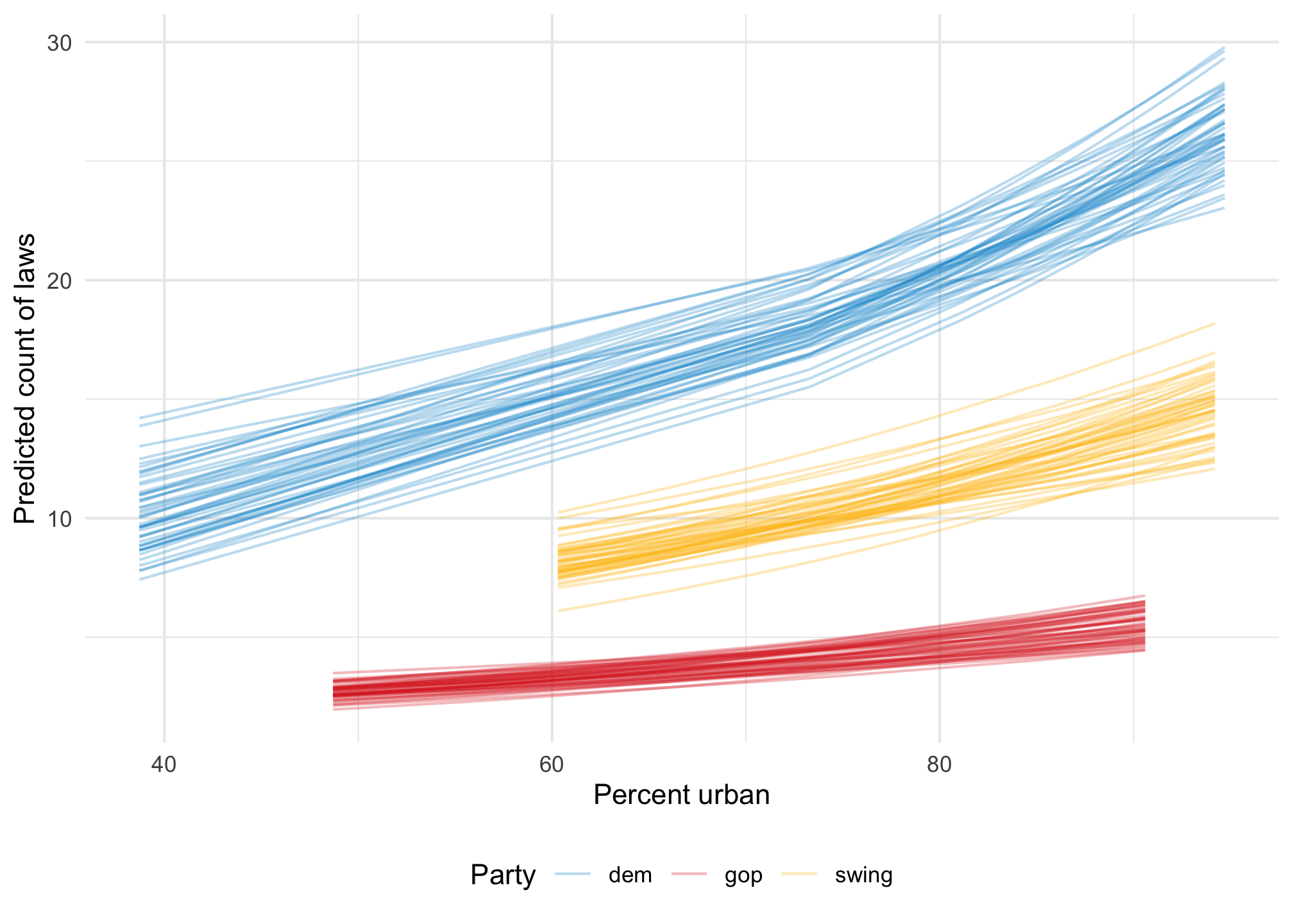
To make life even easier, we can calculate marginal effects instead and get count-level changes in the outcome at specific values of urbanness or across the whole range of the fitted line.

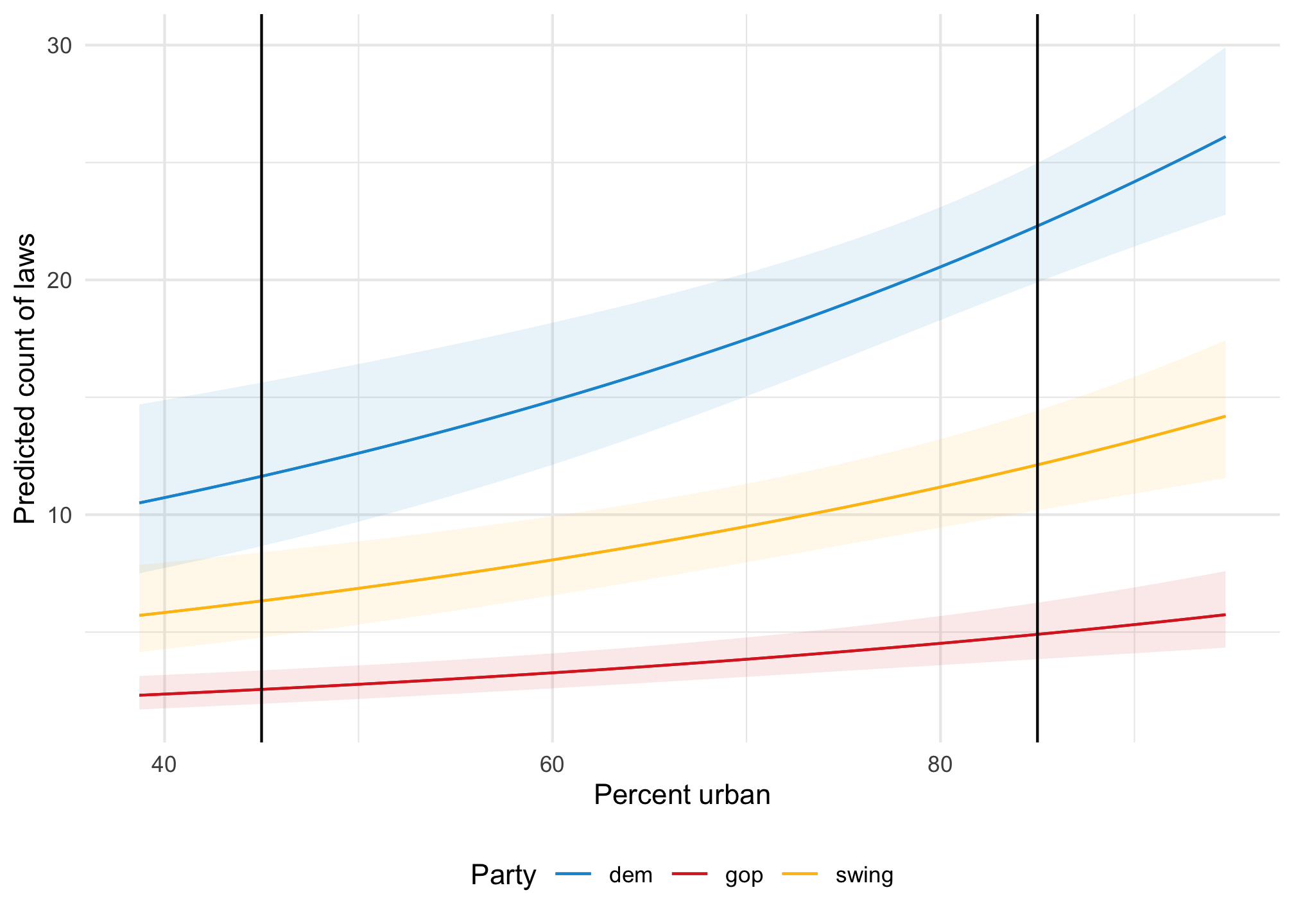
Remember the fitted lines here—the effect or slope of urbanness changes depending on two things:

  • The political party: the line is higher and steeper for democratic states
  • The level of urbanness: the line is shallower in less urban states; steeper in urban states
Code
plot_predictions(model_poisson, condition = c("percent_urban", "historical")) +
  geom_vline(xintercept = c(45, 85)) +
  scale_color_manual(values = c(clr_dem, clr_gop, clr_ind)) +
  scale_fill_manual(values = c(clr_dem, clr_gop, clr_ind), guide = "none") +
  labs(
    x = "Percent urban", 
    y = "Predicted count of laws", 
    color = "Party"
  ) +
  theme(legend.position = "bottom")

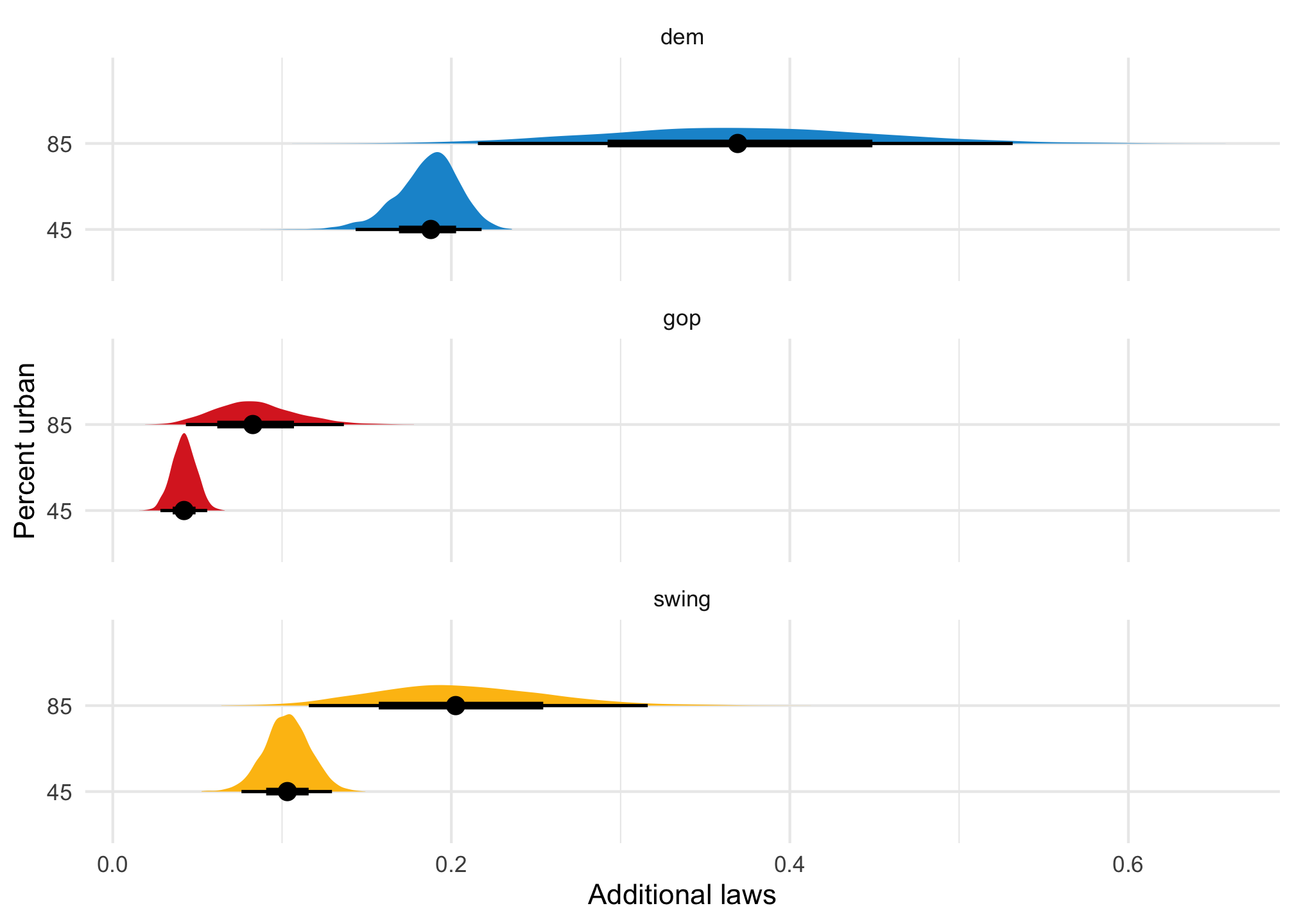
The effect of urbanness on the count of laws is different when a state is less urban (45%) vs. more urban (85%). We can calculate count-level slopes at each of those points:

Code
model_poisson |> 
  slopes(
    newdata = datagrid(percent_urban = c(45, 85), historical = unique),
    variables = "percent_urban"
  )

          Term percent_urban historical Estimate Std. Error     z Pr(>|z|)    S  2.5 % 97.5 %
 percent_urban            45      gop     0.0416    0.00719  5.78   <0.001 27.0 0.0275 0.0557
 percent_urban            45      swing   0.1029    0.01375  7.48   <0.001 43.6 0.0759 0.1298
 percent_urban            45      dem     0.1892    0.01876 10.08   <0.001 77.0 0.1524 0.2259
 percent_urban            85      gop     0.0797    0.02367  3.37   <0.001 10.4 0.0333 0.1261
 percent_urban            85      swing   0.1971    0.05126  3.85   <0.001 13.0 0.0967 0.2976
 percent_urban            85      dem     0.3625    0.08355  4.34   <0.001 16.1 0.1987 0.5262

Columns: rowid, term, estimate, std.error, statistic, p.value, s.value, conf.low, conf.high, percent_urban, historical, predicted_lo, predicted_hi, predicted, laws 
Type:  response 

In Democratic states, a 1 percentage point increase in urbanness is associated with 0.189 additional laws in rural (45%) states and 0.363 additional laws in urban (85%) states; in Republican states, a 1 percentage point increase in urbanness is associated with 0.04 additional laws in rural (45%) states and 0.08 ladditional laws in urban (85%) states.

Instead of disaggregating everything by party and choosing arbitrary values of urbanness, we can also find the overall average slope of the line. Across all states and parties and different levels of urbanness, a 1 percentage point increase in urbanness is associated with 0.17 additional laws, on average.

Code
model_poisson |> 
  avg_slopes(variables = "percent_urban")

          Term Estimate Std. Error    z Pr(>|z|)    S  2.5 % 97.5 %
 percent_urban    0.172     0.0385 4.47   <0.001 17.0 0.0965  0.247

Columns: term, estimate, std.error, statistic, p.value, s.value, conf.low, conf.high 
Type:  response 
Code
model_poisson |> 
  plot_predictions(condition = "percent_urban") +
  labs(
    x = "Percent urban", 
    y = "Predicted count of laws"
  )

Bayesian Poisson models

We can run this model with Bayesian regression too. We’ll set some weakly informative priors and define the model like this:

\[ \begin{aligned} \text{Laws}_i &\sim \operatorname{Poisson}(\lambda_i) \\ \log(\lambda_i) &= \beta_0 + \beta_1\ \text{Percent urban}_i + \beta_2\ \text{GOP}_i + \beta_3\ \text{Swing}_i \\ \\ \beta_0 &\sim \mathcal{N}(0, 2) \\ \beta_{1 \dots 3} &\sim \operatorname{Student t}(\nu = 3, \mu = 0, \sigma = 1) \end{aligned} \]

Here’s what those priors look like:

Code
priors <- c(
  prior(normal(0, 2), class = Intercept),
  prior(student_t(3, 0, 1), class = b)
)

priors |> 
  parse_dist() |> 
  ggplot(aes(y = 0, dist = .dist, args = .args, fill = prior)) +
  stat_slab(normalize = "panels") +
  scale_fill_viridis_d(option = "plasma", begin = 0.2, end = 0.8) +
  facet_wrap(vars(prior), scales = "free_x")

And here’s the model:

Code
model_poisson_bayes <- brm(
  bf(laws ~ percent_urban + historical),
  data = equality,
  family = poisson(),
  prior = priors,
  chains = 4, iter = 2000, seed = 1234,
  file = "models/model_poisson_bayes"
)
Code
model_parameters(model_poisson_bayes, verbose = FALSE) |> tt()
tinytable_9co6u927wc2anabidxtl
Parameter Median CI CI_low CI_high pd Rhat ESS
b_Intercept 1.676 0.95 1.08 2.243 1 1 3413
b_percent_urban 0.017 0.95 0.01 0.024 1 1 3664
b_historicalgop -1.494 0.95 -1.76 -1.241 1 1 2264
b_historicalswing -0.596 0.95 -0.8 -0.385 1 1 2980

We can visualize the posterior distribution for each coefficient:

Code
model_poisson_bayes |> 
  gather_draws(`^b_.*`, regex = TRUE) |>
  mutate(.value = exp(.value)) |>
  mutate(.variable = factor(.variable, 
    levels = c("b_Intercept", "b_percent_urban", 
      "b_historicalgop", "b_historicalswing"),
    ordered = TRUE)) |> 
  ggplot(aes(x = .value, fill = .variable)) +
  stat_halfeye(normalize = "xy") +
  scale_fill_viridis_d(option = "plasma", begin = 0.1, end = 0.9, guide = "none") +
  labs(x = "Coefficient value", y = NULL) +
  facet_wrap(vars(.variable), scales = "free_x") +
  theme(axis.text.y = element_blank())

And we can see posterior predictions, either manually with {tidybayes}…

Code
equality |>
  add_epred_draws(model_poisson_bayes, ndraws = 50) |>
  ggplot(aes(x = percent_urban, y = laws, color = historical)) +
  geom_point(data = equality, size = 1) +
  geom_line(aes(y = .epred, group = paste(historical, .draw)), 
    linewidth = 0.5, alpha = 0.3) +
  scale_color_manual(values = c(clr_dem, clr_gop, clr_ind))

…or more automatically with {marignaleffects}:

Code
model_poisson_bayes |> 
  plot_predictions(condition = c("percent_urban", "historical")) +
  scale_color_manual(values = c(clr_dem, clr_gop, clr_ind)) +
  scale_fill_manual(values = c(clr_dem, clr_gop, clr_ind), guide = "none") +
  labs(
    x = "Percent urban", 
    y = "Predicted count of laws", 
    color = "Party"
  ) +
  theme(legend.position = "bottom")

…or as a fancy spaghetti plot with {marginaleffects}:

Code
model_poisson_bayes |> 
  predictions(condition = c("percent_urban", "historical"), ndraws = 50) |>
  posterior_draws() |> 
  ggplot(aes(x = percent_urban, y = draw, color = historical)) +
  geom_line(aes(y = draw, group = paste(historical, drawid)), 
    size = 0.5, alpha = 0.3) +
  scale_color_manual(values = c(clr_dem, clr_gop, clr_ind)) +
  labs(
    x = "Percent urban", 
    y = "Predicted count of laws", 
    color = "Party"
  ) +
  theme(legend.position = "bottom")

We can interpret the coefficients using marginal effects too. By themselves, we see posterior medians:

Code
model_poisson_bayes |> 
  slopes(
    newdata = datagrid(percent_urban = c(45, 85), historical = unique),
    variables = "percent_urban"
  )

          Term percent_urban historical Estimate  2.5 % 97.5 %
 percent_urban            45      gop     0.0421 0.0281 0.0558
 percent_urban            45      swing   0.1031 0.0760 0.1295
 percent_urban            45      dem     0.1879 0.1435 0.2179
 percent_urban            85      gop     0.0827 0.0432 0.1365
 percent_urban            85      swing   0.2026 0.1158 0.3161
 percent_urban            85      dem     0.3692 0.2157 0.5316

Columns: rowid, term, estimate, conf.low, conf.high, percent_urban, historical, predicted_lo, predicted_hi, predicted, tmp_idx, laws 
Type:  response 

We can also visualize the posterior distributions of the specific marginal effects:

Code
model_poisson_bayes |> 
  slopes(
    newdata = datagrid(percent_urban = c(45, 85), historical = unique),
    variables = "percent_urban"
  ) |> 
  posterior_draws() |> 
  ggplot(aes(x = draw, y = factor(percent_urban), fill = historical)) +
  stat_halfeye(normalize = "panels") +
  scale_fill_manual(values = c(clr_dem, clr_gop, clr_ind), guide = "none") +
  facet_wrap(vars(historical), ncol = 1) +
  labs(x = "Additional laws", y = "Percent urban")