The Beta distribution represents a proportion between 0 and 1, but does not include 0 or 1.
The distribution can be parameterized two different ways:
Shapes: Shape 1 (\(a\)) and Shape 2 (\(b\)), which form a proportion: \(\frac{a}{a + b}\)
Mean and precision: \(\mu\) (mu) for the average, \(\phi\) (phi) for the variance/standard deviation/spread
Code
knitr::opts_chunk$set(fig.align ="center", fig.retina =3)library(tidyverse)library(marginaleffects)library(brms)library(tidybayes)library(parameters)library(tinytable)library(patchwork)library(extraDistr)library(ggridges)library(scales)library(betareg)# Data via the WHO via Kaggle# https://www.kaggle.com/datasets/lsind18/who-immunization-coveragetetanus <-readRDS("data/tetanus_pab.rds")tetanus_2010 <- tetanus |>filter(year ==2010) |># Cheat a littlemutate(prop_pab =ifelse(prop_pab ==1, 0.999, prop_pab))theme_set(theme_minimal())options(digits =3, width =120,tinytable_tt_digits =2)
Distribution intuition
The the Beta distribution is naturally limited to numbers between 0 and 1 (but importantly doesn’t include 0 or 1). The Beta distribution is an extremely flexible distribution and can take all sorts of different shapes and forms (stare at this amazing animated GIF for a while to see all the different shapes!)
Unlike a normal distribution, where you use the mean and standard deviation as the distributional parameters, beta distributions take two non-intuitive parameters: (1) shape1 and (2) shape2, often abbreviated as \(a\) and \(b\). This answer at Cross Validated does an excellent job of explaining the intuition behind beta distributions and it’d be worth it to read it.
Basically beta distributions are good at modeling the probabilities of things, and shape1 and shape2 represent specific parts of a formula for probabilities and proportions.
Let’s say that there’s an exam with 10 points where most people score a 6/10. Another way to think about this is that an exam is a collection of correct answers and incorrect answers, and that the percent correct follows this equation:
To make this formula more general, we can use variable names: \(a\) for the number correct and \(b\) for the number incorrect, leaving us with this:
\[
\frac{a}{a + b}
\]
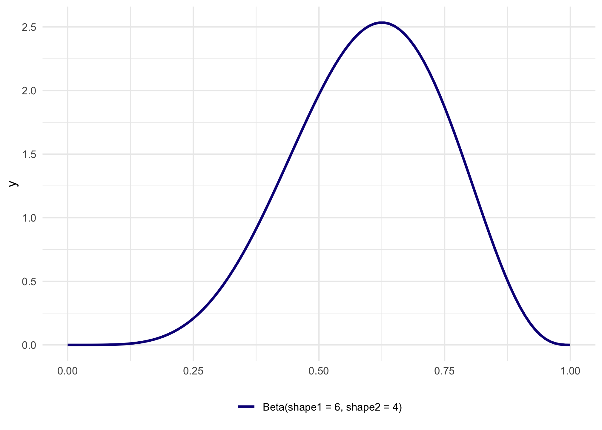
In a Beta distribution, the \(a\) and the \(b\) in that equation correspond to the shape1 and shape2 parameters. If we want to look at the distribution of scores for this test where most people get 6/10, or 60%, we can use 6 and 4 as parameters. Most people score around 60%, and the distribution isn’t centered—it’s asymmetric. Neat!
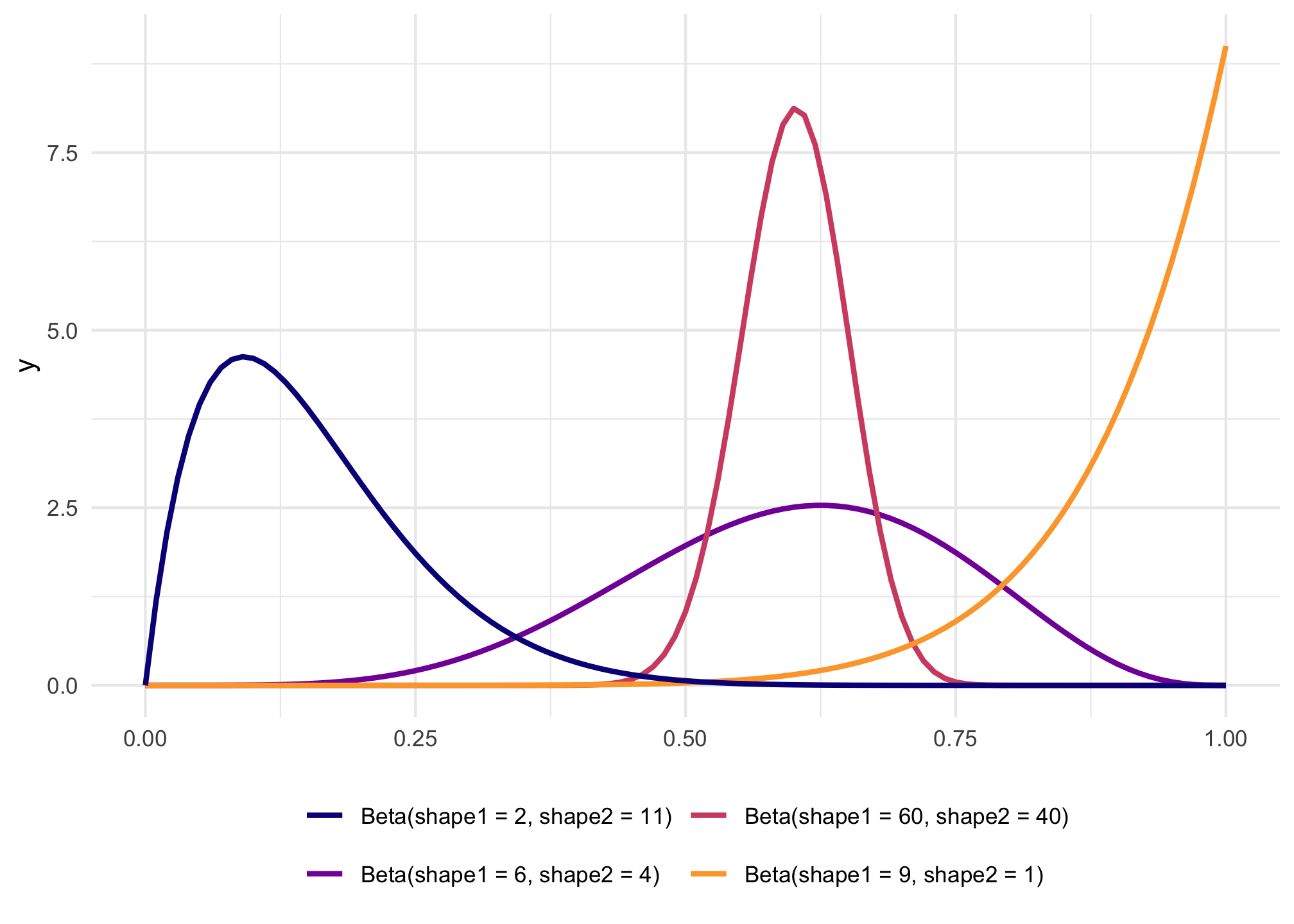
The magic of—and most confusing part about—Beta distributions is that you can get all sorts of curves by just changing the shape parameters. To make this easier to see, we can make a bunch of different Beta distributions.
To figure out the center of each of these distributions, think of the \(\frac{a}{a+b}\) formula. For the blue distribution on the far left, for instance, it’s \(\frac{2}{2+11}\) or 0.154. The orange distribution on the far right is centered at \(\frac{9}{9+1}\), or 0.9. The tall pink-ish distribution is centered at 0.6 (\(\frac{60}{60+40}\)), just like the \(\frac{6}{6+4}\) distribution, but it’s much narrower and less spread out. When working with these two shape parameters, you control the variance or spread of the distribution by scaling the values up or down.
Mean and precision instead of shapes
But thinking about these shapes and manually doing the \(\frac{a}{a+b}\) calculation in your head is hard! It’s even harder to get a specific amount of spread. Most other distributions can be defined with a center and some amount of spread or variance, but with Beta distributions you’re stuck with these weirdly interacting shape parameters.
Fortunately there’s an alternative way of parameterizing the beta distribution that uses a mean \(\mu\) and precision \(\phi\) (the same idea as variance) instead of these strange shapes.
These shapes and the \(\mu\) and \(\phi\) parameters are mathematically related and interchangeable. Formally, the two shapes can be defined using \(\mu\) and \(\phi\) like so:
\[
\begin{aligned}
\text{shape1 } (a) &= \mu \times \phi \\
\text{shape2 } (b) &= (1 - \mu) \times \phi
\end{aligned}
\] It’s thus possible to translate between these two parameterizations:
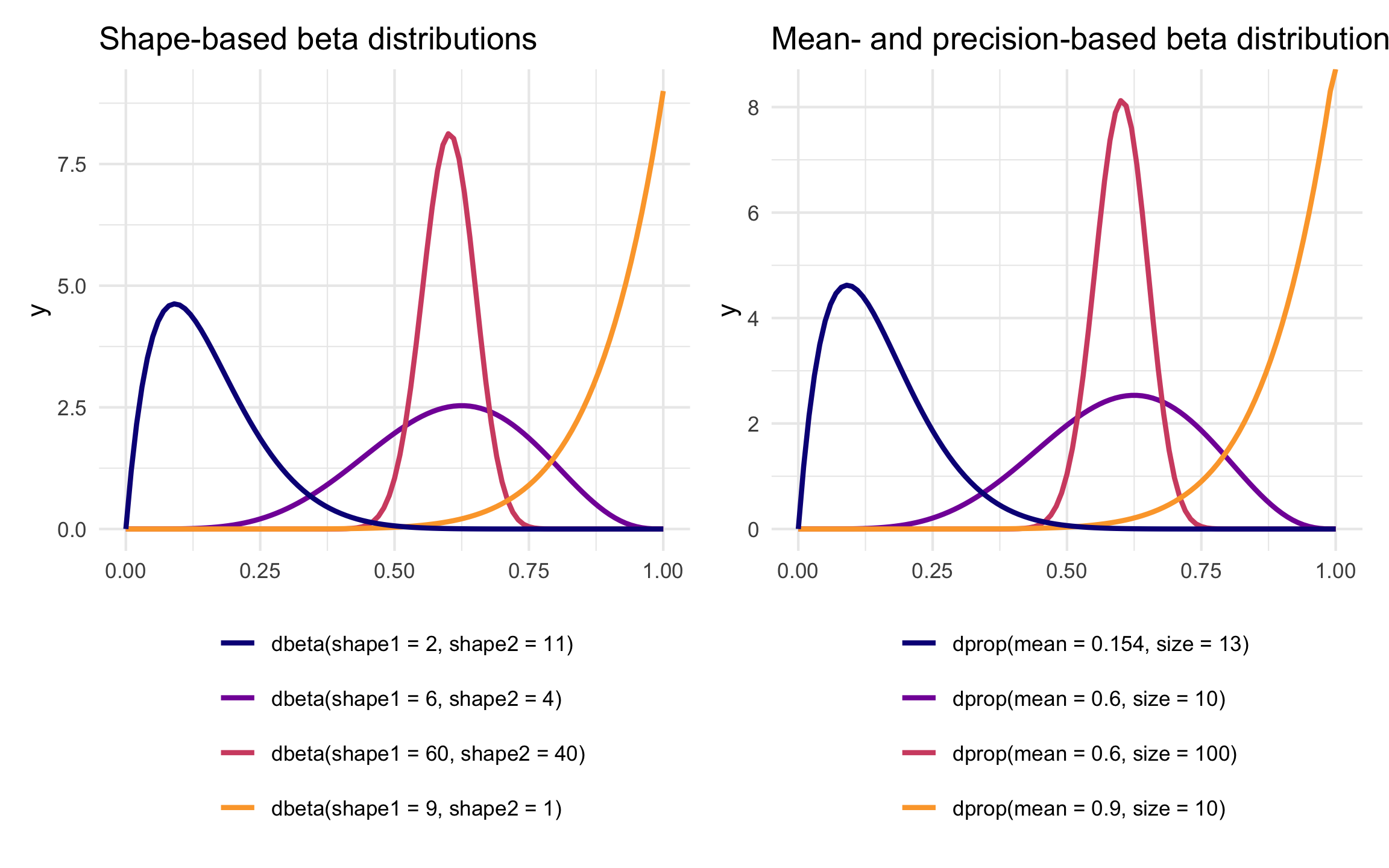
Remember our initial distribution where shape1 was 6 and shape2 was 4? Here’s are the parameters for that using \(\mu\) and \(\phi\) instead:
Code
shapes_to_muphi(6, 4)
$mu
[1] 0.6

$phi
[1] 10
It has a mean of 0.6 and a precision of 10. That more precise and taller distribution where shape1 was 60 and shape2 was 40?
Code
shapes_to_muphi(60, 40)
$mu
[1] 0.6

$phi
[1] 100
It has the same mean of 0.6, but a much higher precision (100 now instead of 10).
R has built-in support for the shape-based beta distribution with things like dbeta(), rbeta(), etc. We can work with this reparameterized \(\mu\)- and \(\phi\)-based beta distribution using the dprop() (and rprop(), etc.) from the {extraDistr} package. It takes two arguments: size for \(\phi\) and mean for \(\mu\).
We can use regression to model the \(\mu\) (mu) and \(\phi\) (phi) parameters of a Beta-distributed outcome. The neat thing about distributional regression like this is that we can model both parameters independently if we want—if we think there’s a reason that precision/spread of the distribution differs across different values of explanatory variables, we can incorporate that! We can also just model the \(\mu\) part and leave \(\phi\) constant.
To make sure the \(\mu\) and \(\phi\) parameters stay positive, we use a logit link function for \(\mu\) and a log link function for \(\phi\). Here I use \(\gamma\) (gamma) for the \(\phi\) coefficients just to show that it’s a different model, but the Xs can be the same:
Example: Modeling the proprotion of tetanus vaccinations
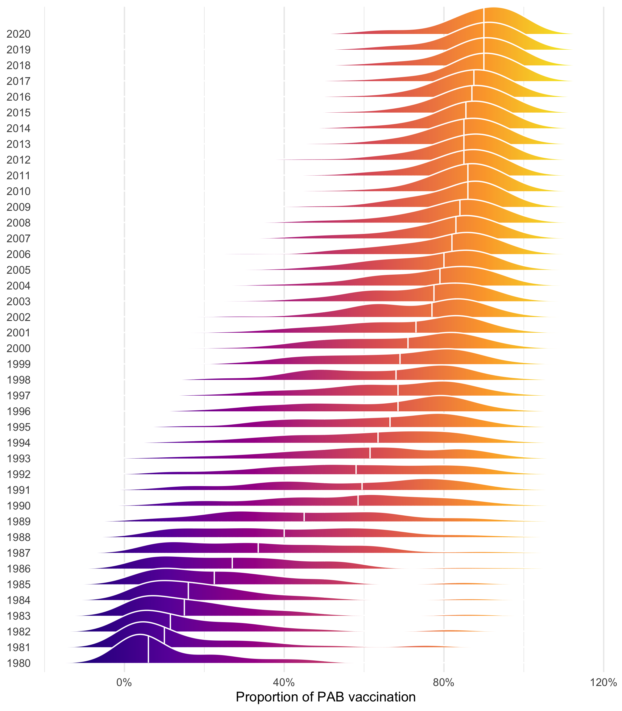
We want to model the proportion of 1-year-olds who are vaccinated against tetanus through maternal vaccination, or protection at birth (PAB) vaccination. This vaccination was introduced in the 1980s and slowly rolled out globally, so that in 2020, more than 80% of the world’s infants are pre-vaccinated against tetanus.
Code
tetanus |>ggplot(aes(x = prop_pab, y =factor(year), fill =after_stat(x))) +geom_density_ridges_gradient(quantile_lines =TRUE, quantiles =2, color ="white") +scale_x_continuous(labels =label_percent()) +scale_fill_viridis_c(option ="plasma", guide ="none") +labs(x ="Proportion of PAB vaccination", y =NULL) +theme(panel.grid.major.y =element_blank())
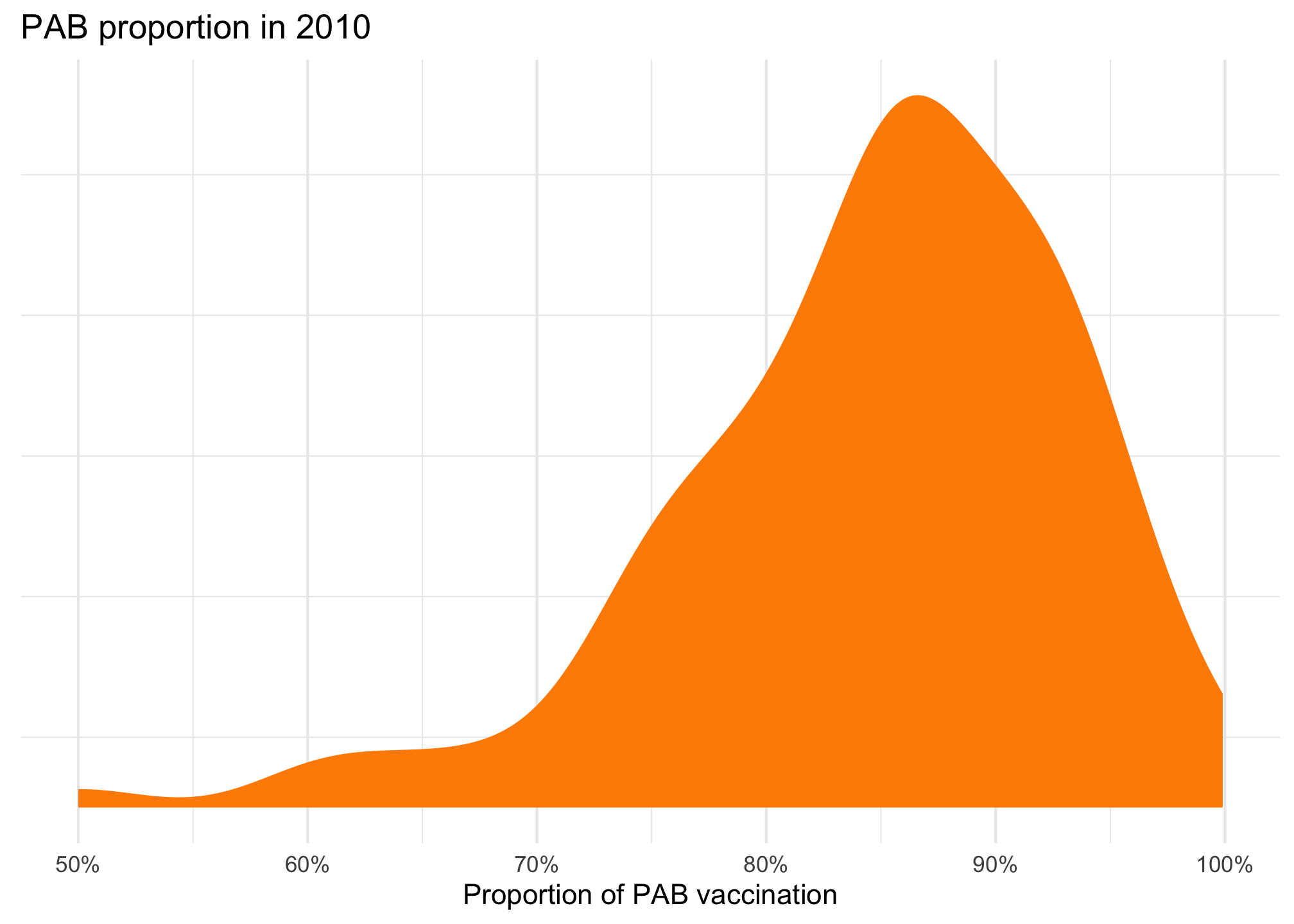
ggplot(tetanus_2010, aes(x = prop_pab)) +geom_density(fill ="darkorange", color =NA) +scale_x_continuous(labels =label_percent()) +labs(title ="PAB proportion in 2010", x ="Proportion of PAB vaccination", y =NULL) +theme(panel.grid.major.y =element_blank(),axis.text.y =element_blank() )
That feels very Beta-y and seems to be clustered around 85%ish. We can actually find its emperical mean and precision by fitting an intercept-only model:
Code
model_int_only <-betareg(prop_pab ~1, data = tetanus_2010)model_int_only
Call:
betareg(formula = prop_pab ~ 1, data = tetanus_2010)

Coefficients (mean model with logit link):
(Intercept)
       1.72

Phi coefficients (precision model with identity link):
(phi)
 14.4
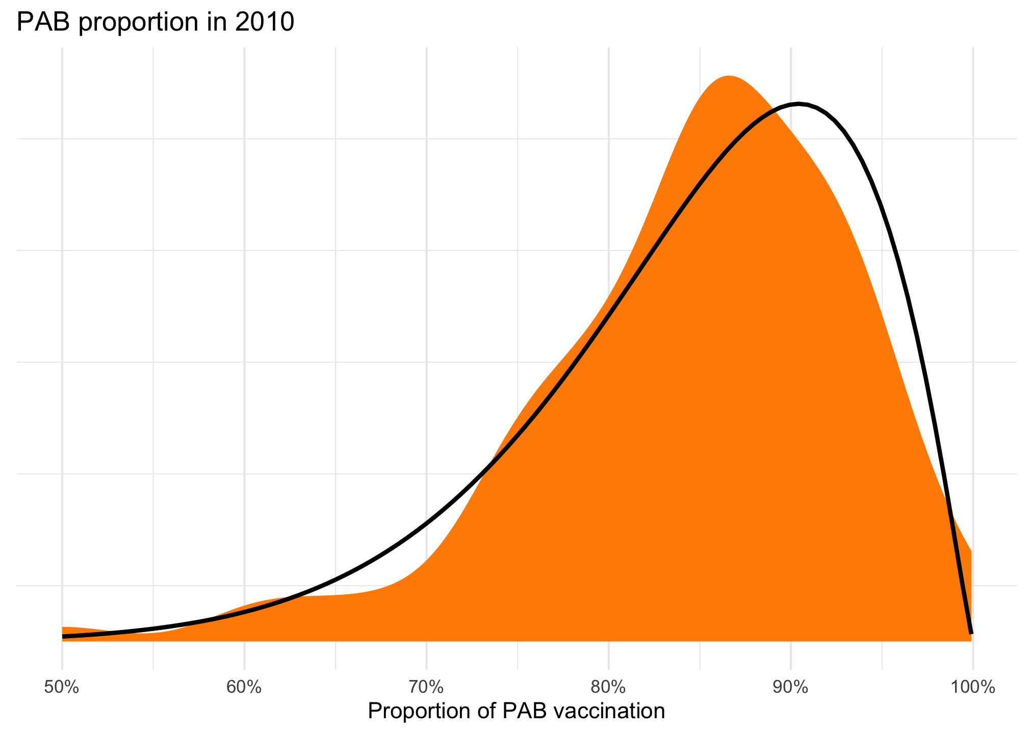
The \(\mu\) is 1.72, but on the logit scale. We can back-transform it to real numbers with plogis(1.72), or 0.848. The \(\phi\) is 14.4.
And here’s what it looks like overlaid on the actual distribution. Not perfect, but pretty close!
Code
ggplot(tetanus_2010, aes(x = prop_pab)) +geom_density(fill ="darkorange", color =NA) +geom_function(fun = dprop, args =list(mean =plogis(1.72), size =14.4),linewidth =1) +scale_x_continuous(labels =label_percent()) +labs(title ="PAB proportion in 2010", x ="Proportion of PAB vaccination", y =NULL) +theme(panel.grid.major.y =element_blank(),axis.text.y =element_blank() )
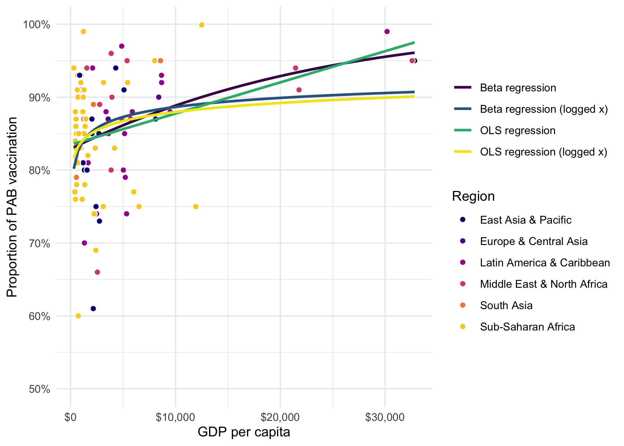
We want to model the proportion of vaccinated infants based on a country’s GDP per capita and its region. Here’s the general relationship. A regular straight OLS line doesn’t fit the data well because GDP per capita is so skewed. We can log GDP per capita, and that helps, but it underpredicts countries with high GDP per capita. Beta regression fits a lot better and captures the outcome.
Code
ggplot(tetanus_2010, aes(x = gdp_per_cap, y = prop_pab)) +geom_point(aes(fill = region), pch =21, size =2, color ="white") +geom_smooth(aes(color ="Beta regression"), se =FALSE, method ="betareg", formula = y ~ x ) +geom_smooth(aes(color ="Beta regression (logged x)"), se =FALSE, method ="betareg", formula = y ~log(x) ) +geom_smooth(aes(color ="OLS regression"), se =FALSE, method ="lm", formula = y ~ x ) +geom_smooth(aes(color ="OLS regression (logged x)"), se =FALSE, method ="lm", formula = y ~log(x) ) +scale_fill_viridis_d(option ="plasma", end =0.9) +scale_color_viridis_d(option ="viridis", end =0.98) +scale_x_continuous(labels =label_dollar()) +scale_y_continuous(labels =label_percent()) +labs(x ="GDP per capita", y ="Proportion of PAB vaccination", color =NULL, fill ="Region" )
Code
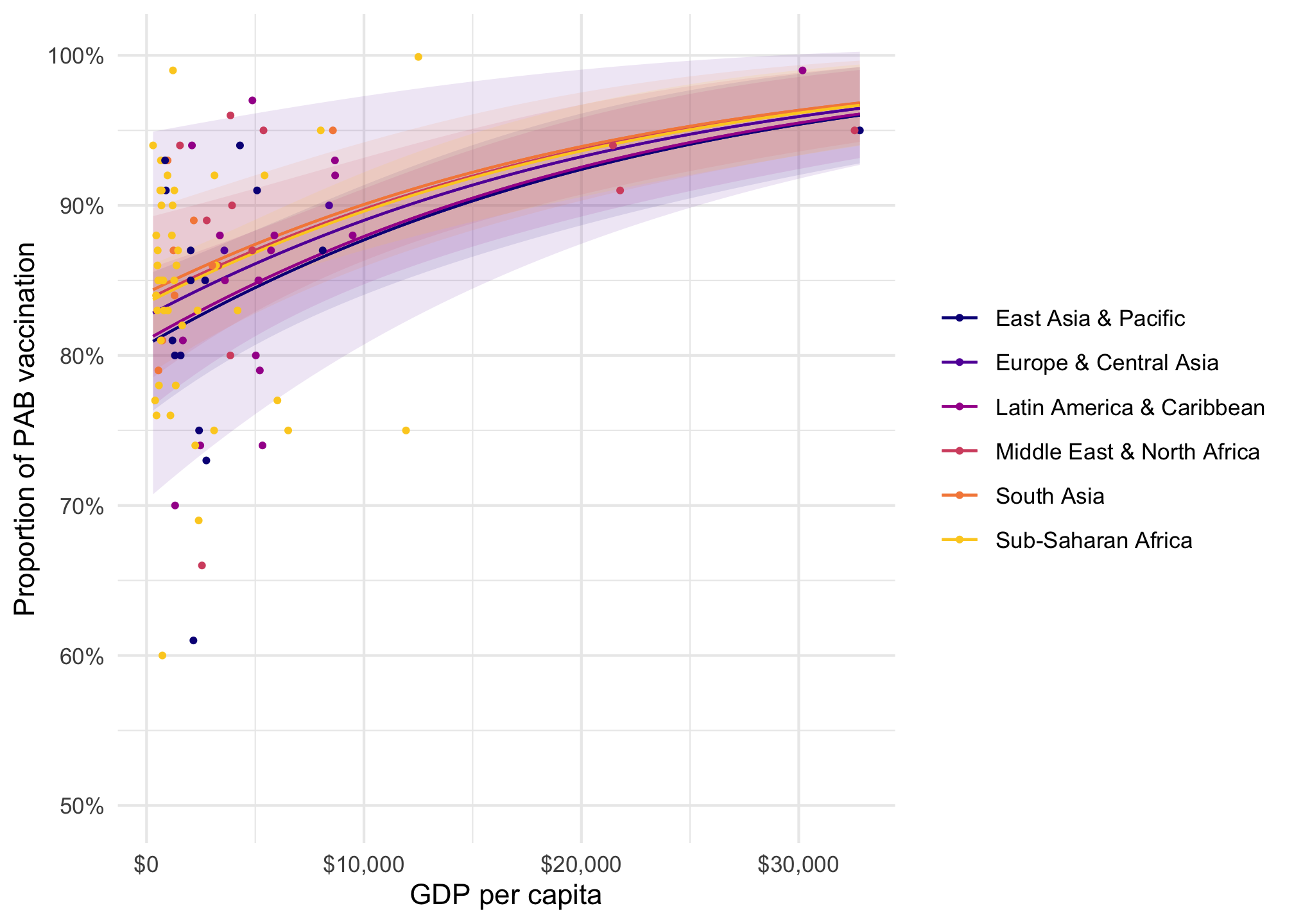
# The formula after the | is for the phi parametermodel_beta <-betareg( prop_pab ~ gdp_per_cap + region |1, data = tetanus_2010,link ="logit")plot_predictions(model_beta, condition =c("gdp_per_cap", "region")) +geom_point(data = tetanus_2010, aes(x = gdp_per_cap, y = prop_pab, color = region),size =0.75 ) +scale_color_viridis_d(option ="plasma", end =0.9) +scale_fill_viridis_d(option ="plasma", end =0.9, guide ="none") +scale_x_continuous(labels =label_dollar()) +scale_y_continuous(labels =label_percent()) +labs(x ="GDP per capita", y ="Proportion of PAB vaccination", color =NULL, fill ="Region" )
Interpreting coefficients
The coefficients in the model are on the logit scale, which make them a little weird to work with. Here’s a basic frequentist model, with coefficients logged and exponentiated:
For the intercept \(\beta_0\), this is the intercept on the logit scale when GDP per capita is 0 in East Asia and the Pacific (since it’s the omitted base case). We can backtransform this to a proportion by inverse logit-ing: plogis(1.430548): 0.807. That means that in an East Asian country with no economy whatsoever, we’d expect that 80%ish of 1-year-olds would be vaccinated.
For the GDP per capita \(\beta_1\) coefficient, this is the slope of the line on the logit scale. We can expect the logged odds of vaccination to increase by 0.000053 for every \$1 increase in GDP per capita. That’s tiny, so we can think of \$1,000 increases instead. Boosting GDP per capita by $1,000 increases the logged odds of vaccination by 0.053. Whatever that means.
We can also exponentiate that (\(e^{0.000053 \times 1000} = 1.05\)) to get an odds ratio, which means that a $1,000 increase in GDP per capita is associated with a 5% increase in vaccination rates (though not a 5 percentage point increase).
For the region coefficients, these are the shifts in the logit-scale East Asia and Pacific intercept (again because it’s the omitted base case). We’d thus expect the proportion of vaccinations to be plogis(1.430548 + 0.240109) or 0.842 in South Asia, etc.
Logged odds are weird; odds ratios are weird. Nobody thinks this way. Thinking about percentage-point-scale values is much easier. We can do this by calculating marginal effects instead and getting proportion-level changes in the outcome at specific values of GDP per capita or across the whole range of the fitted line.
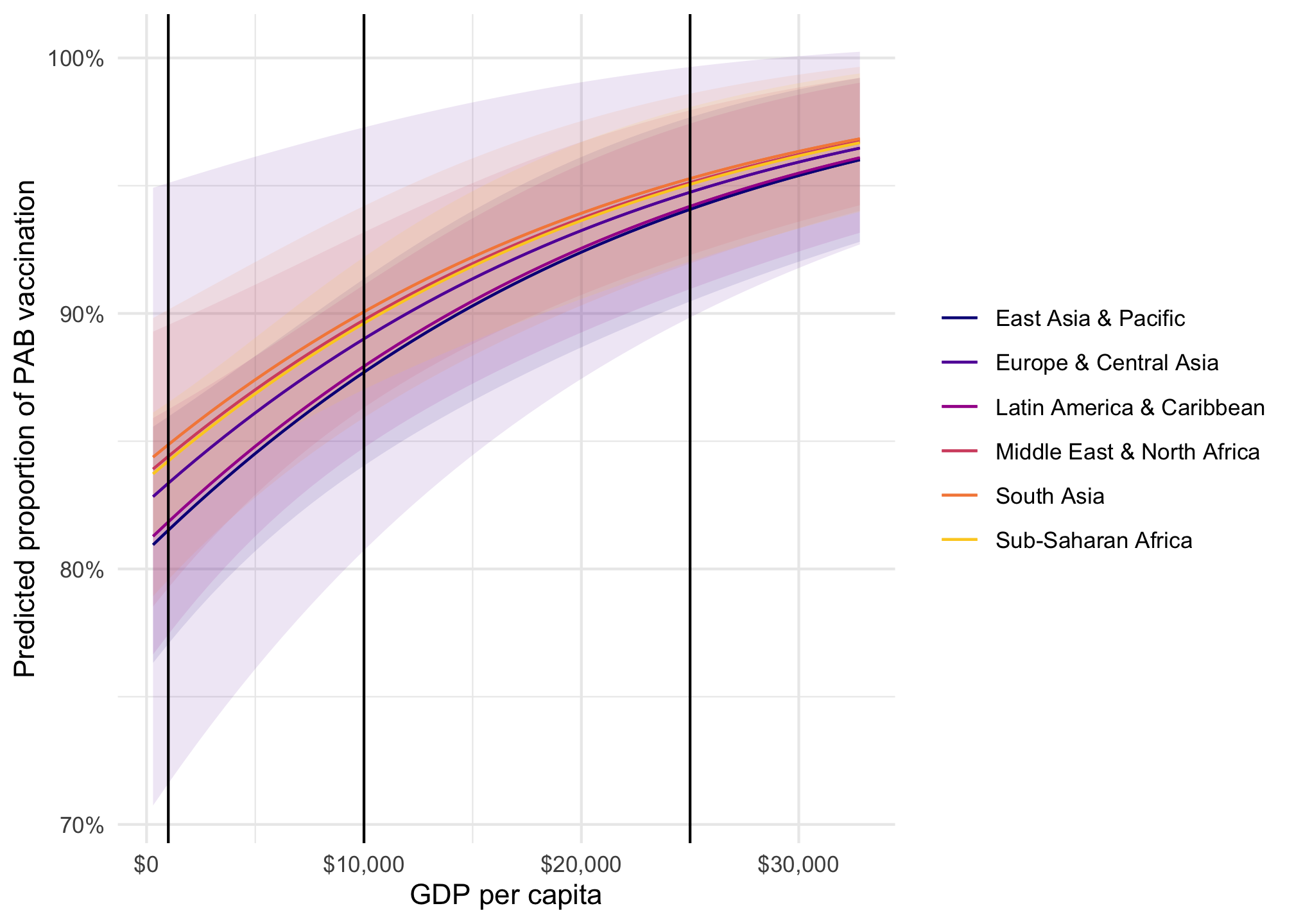
Remember the fitted lines here—the effect or slope of GDP per capita changes depending on two things:
The region: the line is slightly higher and steeper in different regions (though not much here)
The level of GDP per capita: the line is shallower in richer countries; steeper in poorer countries
Code
model_beta |>plot_predictions(condition =c("gdp_per_cap", "region")) +geom_vline(xintercept =c(1000, 10000, 25000)) +scale_color_viridis_d(option ="plasma", end =0.9) +scale_fill_viridis_d(option ="plasma", end =0.9, guide ="none") +scale_x_continuous(labels =label_dollar()) +scale_y_continuous(labels =label_percent()) +labs(x ="GDP per capita", y ="Predicted proportion of PAB vaccination", color =NULL, fill ="Region" )
The effect of GDP per capita on the proportion of vaccinations is different when a country is poorer vs. richer. We can calculate proportion-level slopes at each of those points. These are going to look suuuuuper tiny because they’re based on \$1 changes in GDP per capita, so we’ll need to multiply them by 1000 to think of \$1,000 changes. We’ll also multiply them by 100 one more time since these are percentage point changes in the outcome:
Code
model_beta |>slopes(newdata =datagrid(gdp_per_cap =c(1000, 10000, 25000), region = unique),variables ="gdp_per_cap" ) |>mutate(estimate = estimate *1000*100) |>as_tibble() |># The changed column disappears from the data.table printing :shrug:select(gdp_per_cap, region, estimate) |>pivot_wider(names_from = region, values_from = estimate) |>tt(caption ="Percentage point changes in the proportion of vaccinated children")
tinytable_m0hegdnjlwdcwu1xdcc2
Percentage point changes in the proportion of vaccinated children
gdp_per_cap
South Asia
Europe & Central Asia
Middle East & North Africa
Sub-Saharan Africa
Latin America & Caribbean
East Asia & Pacific
1000
0.69
0.74
0.7
0.71
0.79
0.8
10000
0.48
0.52
0.49
0.5
0.57
0.58
25000
0.24
0.27
0.25
0.25
0.29
0.3
In South Asia, a \$1,000 increase in GDP per capita for super poor countries where GDP per capita is only \$1,000 (i.e. going from \$1,000 to \$2,000) is associated with a 0.69 percentage point increase in the vaccination rate, while in rich countries where GDP per capita is \$25,000, a \$1,000 increase (i.e. going from \$25,000 to \$26,000) is associated with only a 0.24 percentage point increase. The slope in richer countries is shallower.
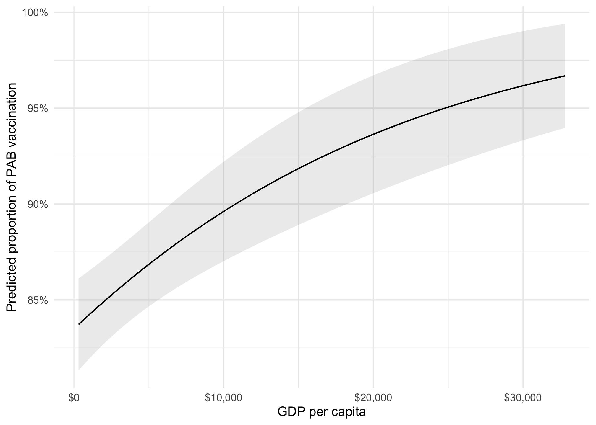
Instead of disaggregating everything by region and choosing arbitrary values of GDP per capita, we can also find the overall average slope of the line. Across all countries and regions different levels of GDP per capita, a $1,000 increase in GDP per capita is associated with a 0.665 percentage point increase in the proportion of vaccinated children, on average.
model_beta |>plot_predictions(condition ="gdp_per_cap") +scale_x_continuous(labels =label_dollar()) +scale_y_continuous(labels =label_percent()) +labs(x ="GDP per capita", y ="Predicted proportion of PAB vaccination", color =NULL, fill ="Region" )
Bayesian Beta models
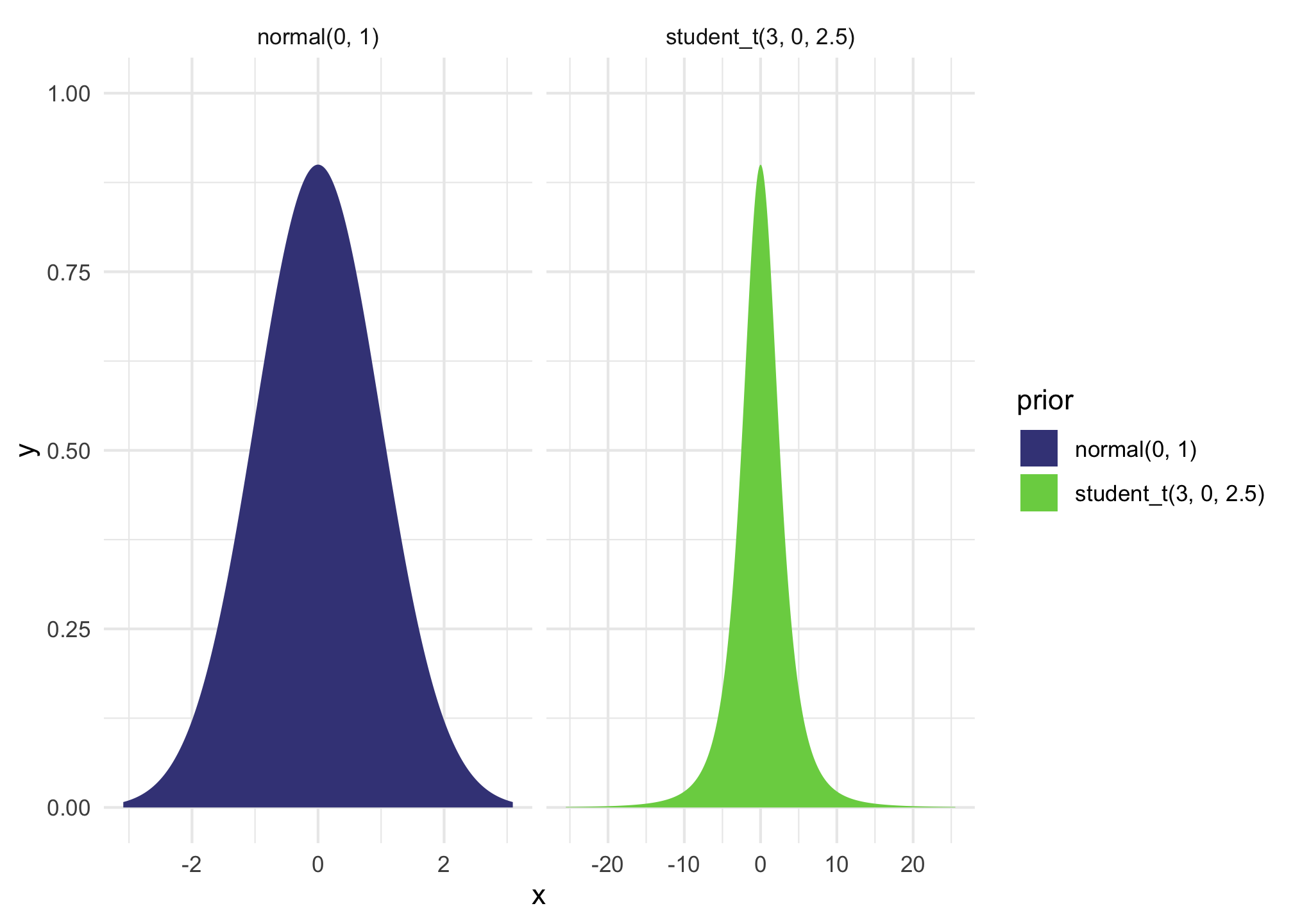
We can run this model with Bayesian regression too. We’ll set some weakly informative priors and define the model like this. If we had more data, we could also model the variance, or \(\phi\), but we won’t here.
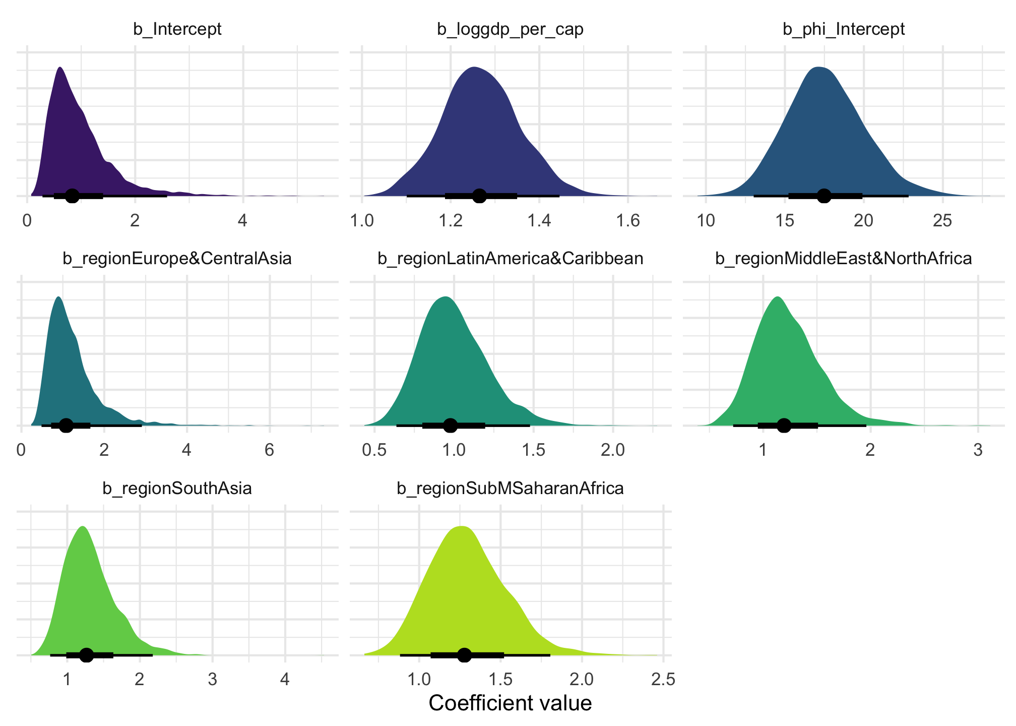
We can visualize the posterior distribution for each coefficient:
Code
model_beta_bayes |>gather_draws(`^b_.*`, regex =TRUE) |>mutate(.value =exp(.value)) |>ggplot(aes(x = .value, fill = .variable)) +stat_halfeye(normalize ="xy") +scale_fill_viridis_d(option ="viridis", begin =0.1, end =0.9, guide ="none") +labs(x ="Coefficient value", y =NULL) +facet_wrap(vars(.variable), scales ="free_x") +theme(axis.text.y =element_blank())
And we can see posterior predictions, either manually with {tidybayes}…
Code
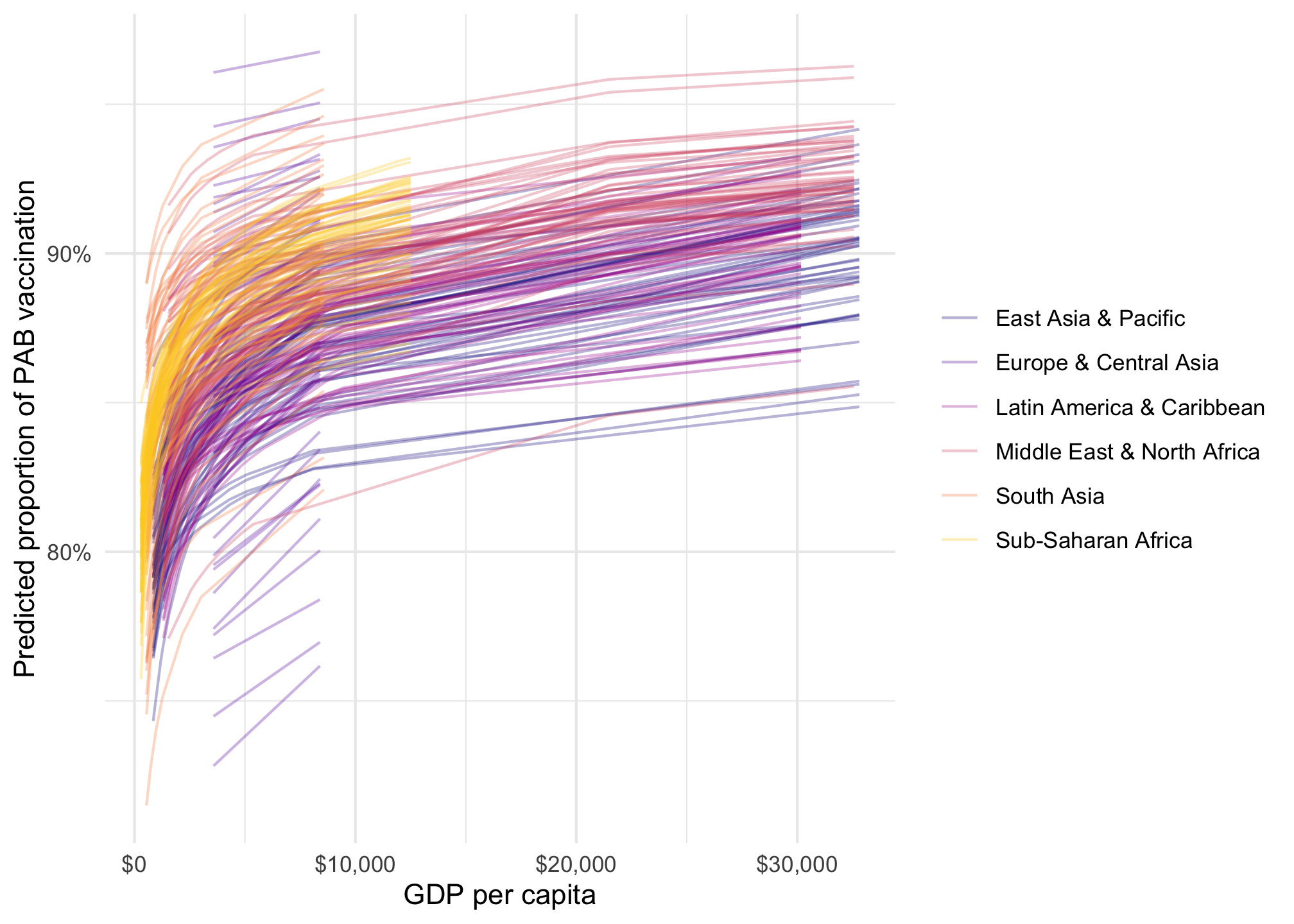
tetanus_2010 |>add_epred_draws(model_beta_bayes, ndraws =50) |>ggplot(aes(x = gdp_per_cap, y = prop_pab, color = region)) +geom_point(data = tetanus_2010, size =1) +geom_line(aes(y = .epred, group =paste(region, .draw)), linewidth =0.5, alpha =0.3) +scale_color_viridis_d(option ="plasma", end =0.9) +scale_x_continuous(labels =label_dollar()) +scale_y_continuous(labels =label_percent()) +labs(x ="GDP per capita", y ="Predicted proportion of PAB vaccination", color =NULL, fill ="Region" )
…or more automatically with {marignaleffects}:
Code
model_beta_bayes |>plot_predictions(condition =c("gdp_per_cap", "region")) +scale_color_viridis_d(option ="plasma", end =0.9) +scale_fill_viridis_d(option ="plasma", end =0.9, guide ="none") +scale_x_continuous(labels =label_dollar()) +scale_y_continuous(labels =label_percent()) +labs(x ="GDP per capita", y ="Predicted proportion of PAB vaccination", color =NULL, fill ="Region" )
…or as a fancy spaghetti plot with {marginaleffects}:
Code
model_beta_bayes |>predictions(condition =c("gdp_per_cap", "region"), ndraws =50) |>posterior_draws() |>ggplot(aes(x = gdp_per_cap, y = draw, color = region)) +geom_line(aes(y = draw, group =paste(region, drawid)), size =0.5, alpha =0.3) +scale_color_viridis_d(option ="plasma", end =0.9) +scale_x_continuous(labels =label_dollar()) +scale_y_continuous(labels =label_percent()) +labs(x ="GDP per capita", y ="Predicted proportion of PAB vaccination", color =NULL, fill ="Region" )
We can interpret the coefficients using marginal effects too. By themselves, we see posterior medians:
        Term gdp_per_cap                     region Estimate    2.5 %   97.5 %
 gdp_per_cap        1000 South Asia                 3.08e-05 1.17e-05 5.35e-05
 gdp_per_cap        1000 Europe & Central Asia      3.33e-05 9.79e-06 7.03e-05
 gdp_per_cap        1000 Middle East & North Africa 3.23e-05 1.09e-05 6.04e-05
 gdp_per_cap        1000 Sub-Saharan Africa         3.10e-05 1.24e-05 5.00e-05
 gdp_per_cap        1000 Latin America & Caribbean  3.68e-05 1.26e-05 6.66e-05
 gdp_per_cap        1000 East Asia & Pacific        3.61e-05 1.33e-05 6.28e-05
 gdp_per_cap       10000 South Asia                 2.03e-06 9.60e-07 3.14e-06
 gdp_per_cap       10000 Europe & Central Asia      2.27e-06 7.74e-07 4.63e-06
 gdp_per_cap       10000 Middle East & North Africa 2.16e-06 9.14e-07 3.51e-06
 gdp_per_cap       10000 Sub-Saharan Africa         2.05e-06 1.06e-06 2.69e-06
 gdp_per_cap       10000 Latin America & Caribbean  2.52e-06 1.08e-06 3.96e-06
 gdp_per_cap       10000 East Asia & Pacific        2.46e-06 1.14e-06 3.65e-06
 gdp_per_cap       25000 South Asia                 6.75e-07 3.50e-07 1.01e-06
 gdp_per_cap       25000 Europe & Central Asia      7.60e-07 2.71e-07 1.53e-06
 gdp_per_cap       25000 Middle East & North Africa 7.21e-07 3.38e-07 1.11e-06
 gdp_per_cap       25000 Sub-Saharan Africa         6.79e-07 3.95e-07 8.37e-07
 gdp_per_cap       25000 Latin America & Caribbean  8.48e-07 4.05e-07 1.24e-06
 gdp_per_cap       25000 East Asia & Pacific        8.26e-07 4.27e-07 1.15e-06

Columns: rowid, term, estimate, conf.low, conf.high, gdp_per_cap, region, predicted_lo, predicted_hi, predicted, tmp_idx, prop_pab
Type:  response
We can also visualize the posterior distributions of the specific marginal effects:
Code
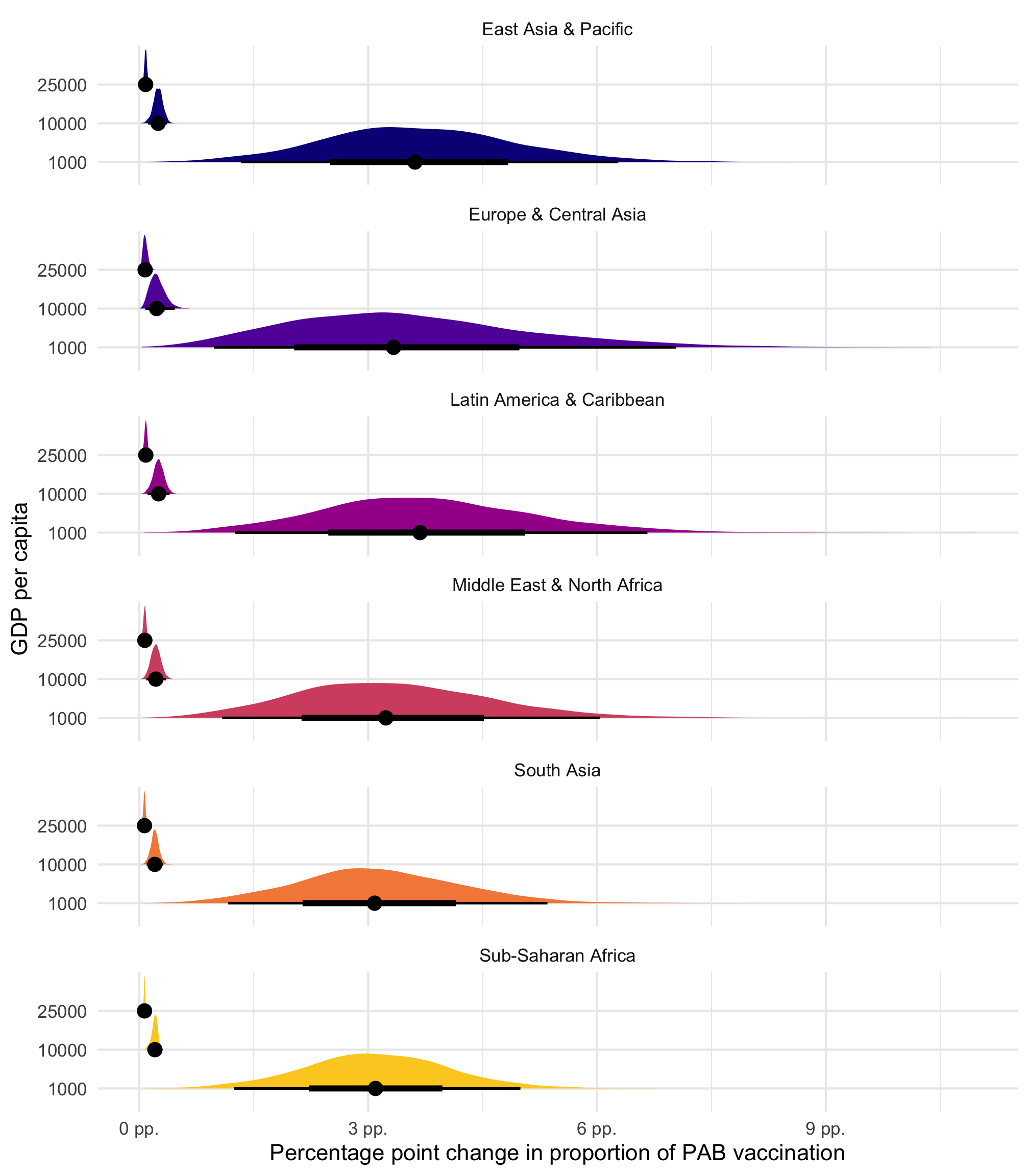
model_beta_bayes |>slopes(newdata =datagrid(gdp_per_cap =c(1000, 10000, 25000), region = unique),variables ="gdp_per_cap" ) |>posterior_draws() |>mutate(draw = draw *1000) |>ggplot(aes(x = draw, y =factor(gdp_per_cap), fill = region)) +stat_halfeye(normalize ="xy") +scale_x_continuous(labels =label_number(scale =100, suffix =" pp.")) +scale_fill_viridis_d(option ="plasma", end =0.9, guide ="none") +facet_wrap(vars(region), ncol =1) +labs(x ="Percentage point change in proportion of PAB vaccination", y ="GDP per capita" )

